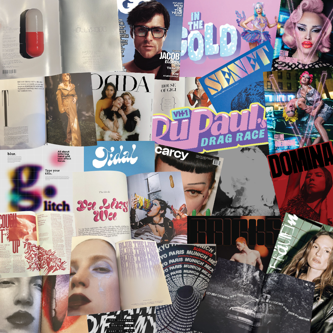
The image above shows the moodboard that I put together after an early research phase, which involved visiting
Magculture, and immersing myself in the world of independent Zines.
seem to benefit from a solid, boldmasthead with either a solid fill (with or without a specialfinsish applied). While keeping the masthead simple andrecognisable, the editorial designers seem to then exploreand experiment with typography in the inside pagesof the zines, applying 3D effects and other manipulationtechniques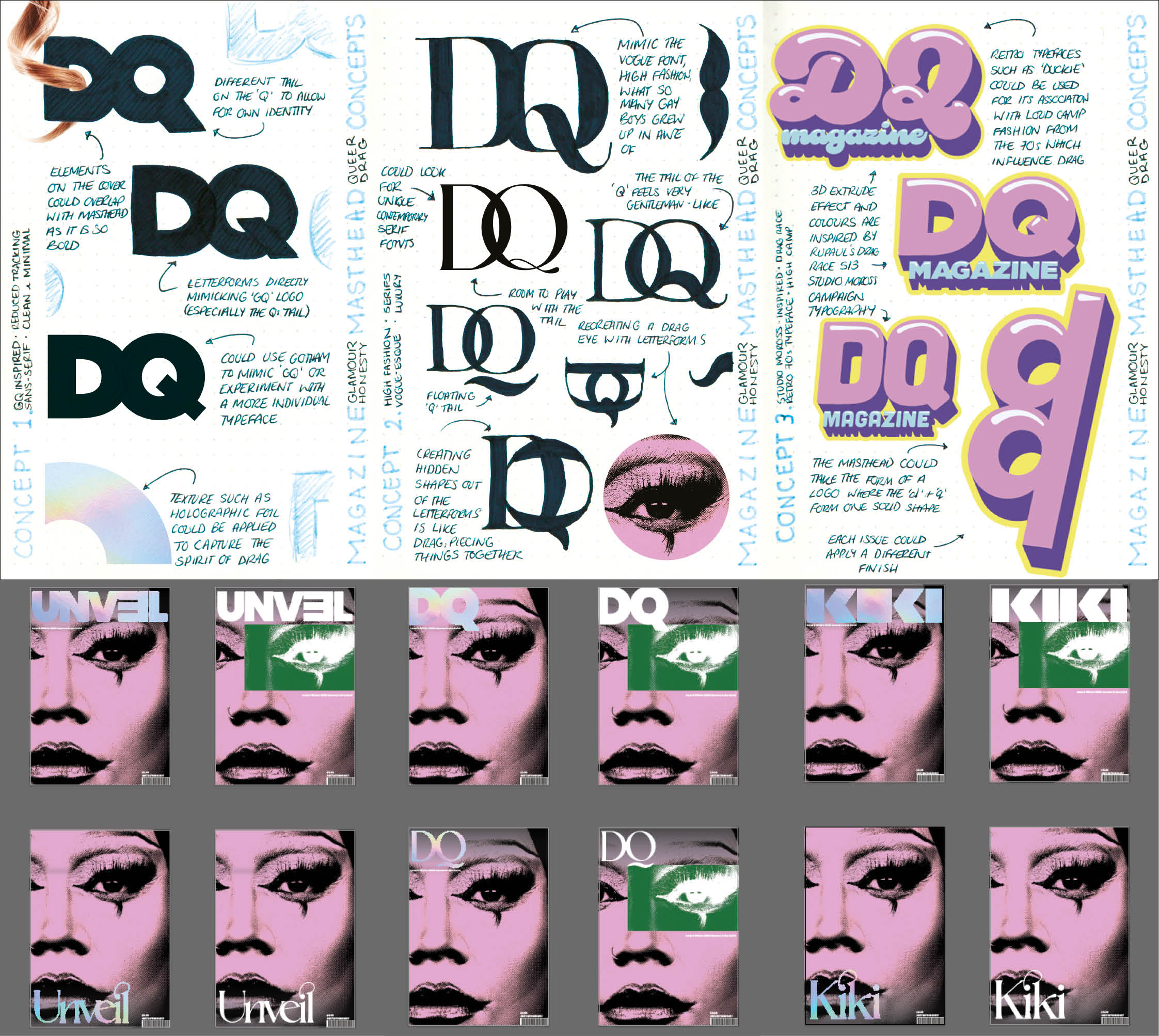
After deciding on a name by organising a small naming workshop inspired by one that was held during my time at a Brand Potential internship, I began developing mastheads. To begin the masthead design process, I considered three stylistic directions; GQ replication, Vogue-esque serif, and Drag Race season 13-inspired 3D type. Each one purposefully fits into a category or style – or in the GQ concept,directly replicates it – as that is what lies at the heart of drag. Drag parodies pop culture, masculinity, politics, and often society itself, so it felt apt to do the same within my masthead design.
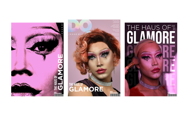
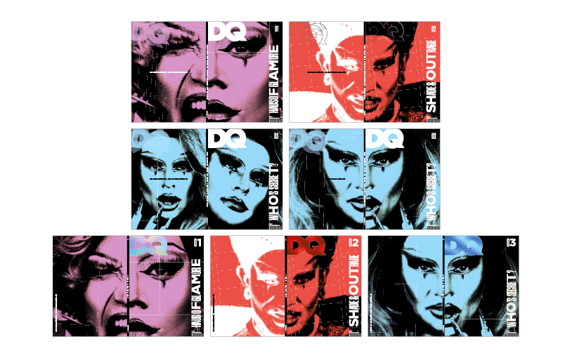
While I experimented with masthead design and placement,I also played around with the tone of the covers by choosing different cover images for each, one edgy and intimate with a halftone filter applied, one in direct imitation of GQ-style polished headshots, and one stripped back showing a focus on the process behind the transformation. The most successful of the three appearted to be the first, as the halftone, and bold colour screamed independent magazine and would be most likely to capture attention on a busy shelf.
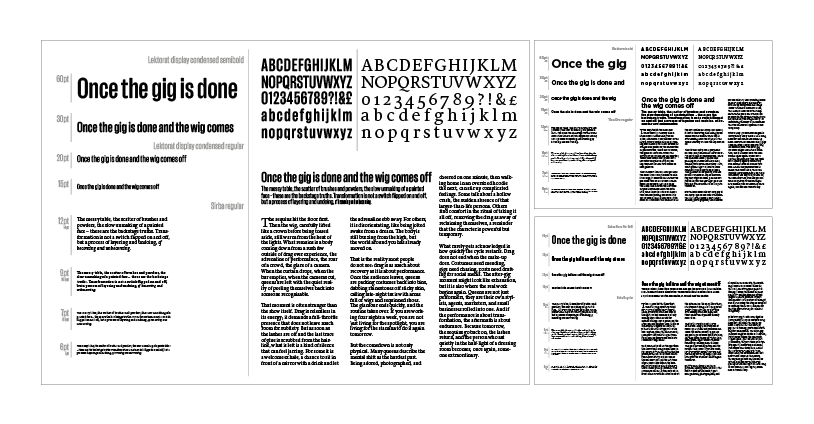
It was important to consider the typeface pairings carefully, and to do this I put together a few pairing charts to get the feel how the different choices interacted with one another. The combination of Lektorat and Sirba appeared to be the most appropriate due to their similar x-height, and overall stylistic pairing. As Gotham was originally considered due to its association with GQ Magazine, I also included this as a third option for variation.
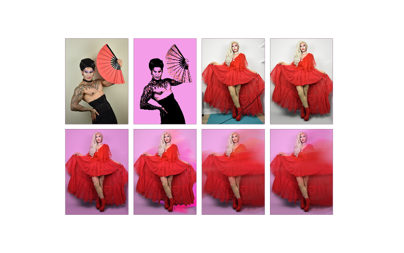
As the large majority of images that feature in the magazine were self-taken, the editing process played an important role in the execution of the Zine. The introduction of a halftone and pink overlay efffect, ensured that the inside pages tie in thematically with the chosen cover design, as well as adding a bold pop of colour throughout. The process of editing photo featuring the red dress shown in the images above, involved cleaning up the skin, removing the background, replacing the background with adjusted colours, and adding a path plur to add some motion and dynamism to the composition.
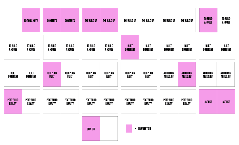
Before jumping straight into designing the spreads, I wanted to first plan out the structure of my articles. To continue the parodying of masculinity throughout the Zine, I decided on an article naming scheme that would exclusively feature words to do with building and constractuion as they are often seen as very masculine topics. The articles begin with the concept of 'getting into drag' and end with 'getting out of drag', taking the reader on a visual journey.
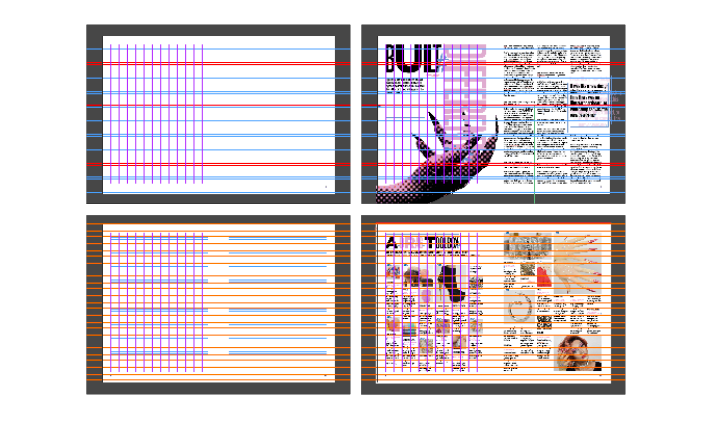
I decided on a 12-column-grid as it alowed for a good balance between freedom and structure and enabled me to vary the widths of my columns depending on the content of the specific article. The use of an eight-row image-grid was loose as I was very fluid with my imagery and very rarely used an image with a straight rectangular border. This felt apt for the content of the magazine, it is all about not fitting inside a box and breaking boundaries.
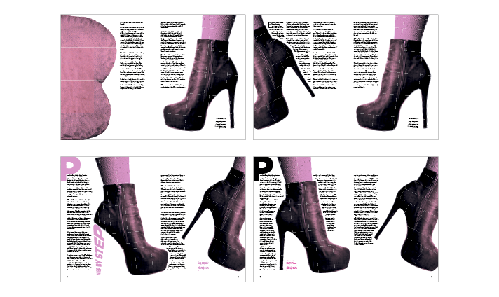
While I felt fairly confident that I could design an engaging article opener, when it came to article layout, I found it much more challenging. Initially I had the mindset that once an image is used in an article, that is its potential used up, and I should aim for one to two images per spread. It was not until I received feedback that I realised that magazine design was so much more fluid than that, and the main goal was actually to tell a story, and take the reader on a visual journey with images and text.
After deciding on a typographic treatment for the article openers (which involved a mismatching of letterforms), I decided that the cover needed to incorporate this level of fun and experimentation with typography too. As this was the front cover, I thought that I could push it one step further and use the letters set in Gotham to spell out an alternate title (that of course still relates to the issue). This offers a not-so-hidden double meaning to the title, like so many Drag names contain, such as: Courtney Act (Caught in the act), Heidi N Closet (Hiding in the closet), Penny Tration..., and the list goes on.
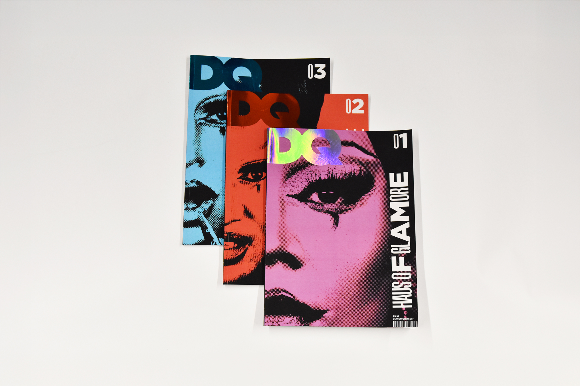
I opted for a soft-touch laminate finish as it removes the publication from the ‘Glossy mag’ category that GQ falls into, and sets it securely in the independent magazine world. While I was certain that I wanted to apply a holographic foil finish to the masthead on issue 1, it was more of a process with the other issues, experimenting with a range of finshes, only to conclude that a matching colour of foil resulted in the most interesting outcome.
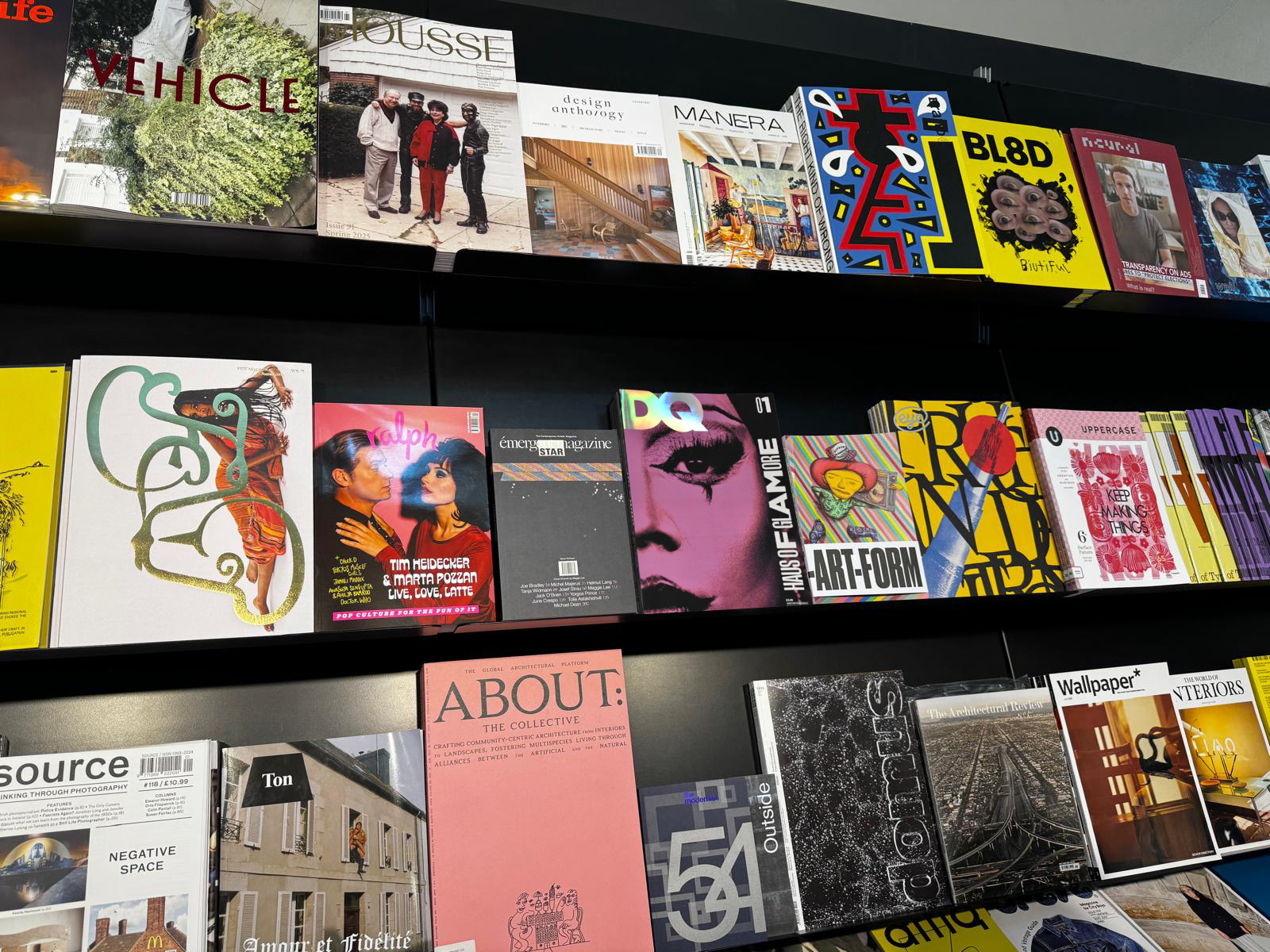
It is important to always examine cover designs in their context, so I placed the cover in the context of a Magculture shelf to see if it stood out among the sea of covers. While this mockup may be cheating a little as the foil is glistening in just the right lighting, I would say that this cover is striking enough to stand out on a shelf of independent magazines due to its bold colour, interesting use of typography and zoomed in crop.