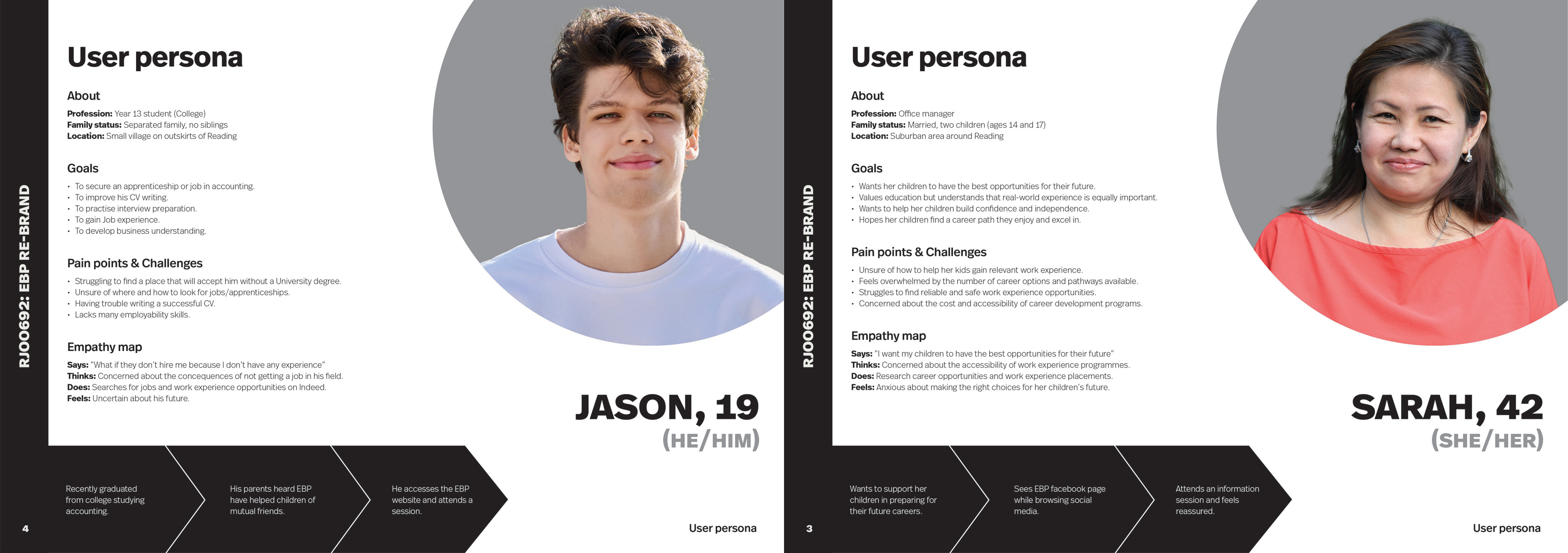
As EBP targets two distinct stakeholder groups – students/youth and business owners/employers – it was important to develop user personas for each to better understand their needs and behaviours.
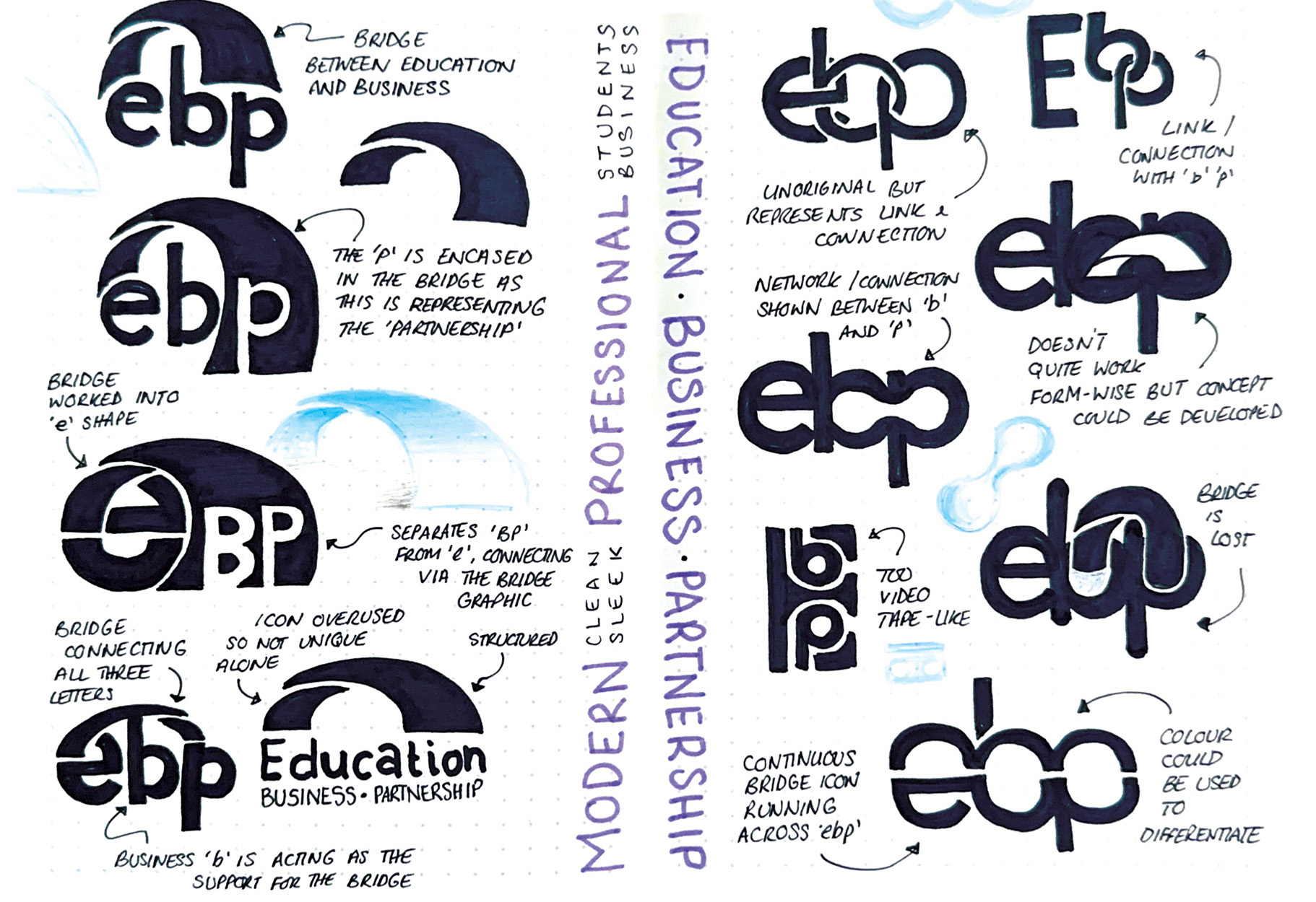
A recurring theme of ‘bridging’ education and business emerged during our initial client meeting, which I incorporated into several of my sketched concepts shown above.
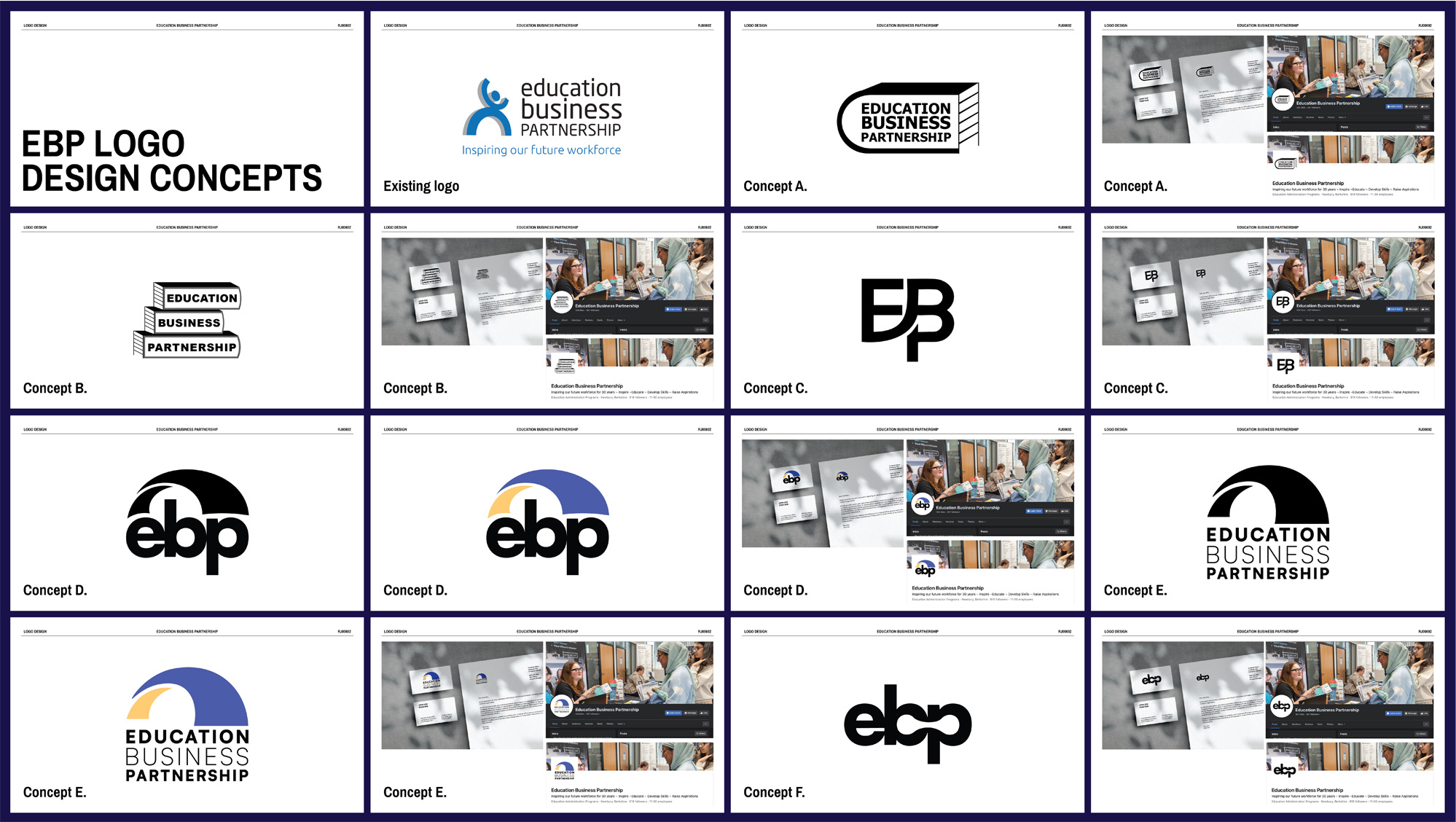
After digitising and refining the sketches, we presented the client with six options, including print and social media mockups for each one to demonstrate how the branding could be applied.
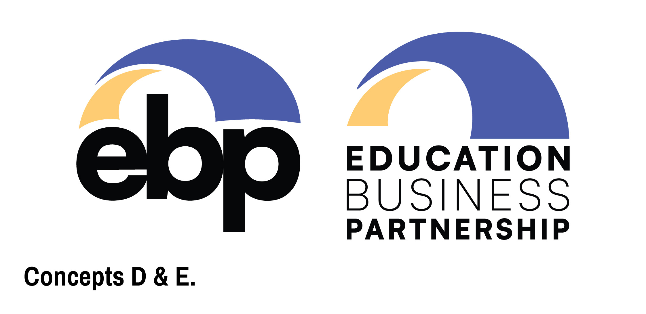
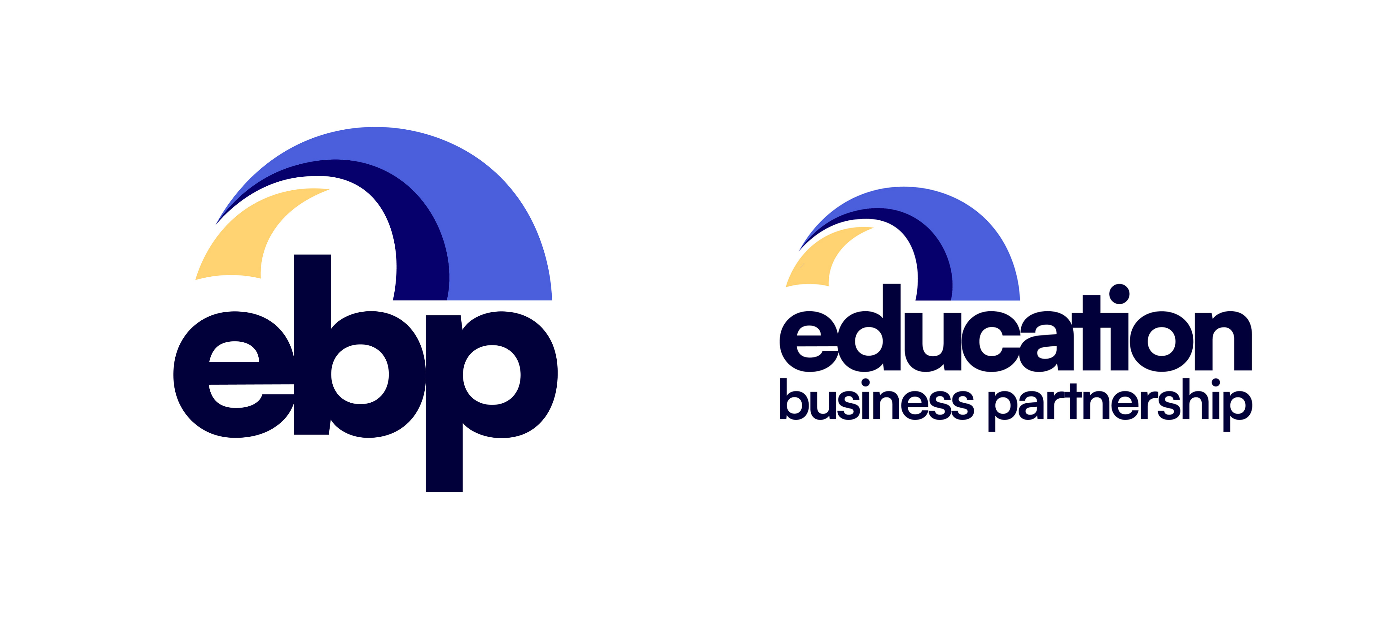
The client chose to move forward with Concepts D and E, combining the two. They requested one logo using the full organisation name, ‘Education Business Partnership’, and another using the acronym ‘EBP’.
The client noted that different sectors of the organisation are categorised by four colours. As redesigning the website was out of scope, they requested these colours be incorporated into the logo. This inspired the addition of a third element to the bridge icon, so that, including the type, the new logo featured all four colours.
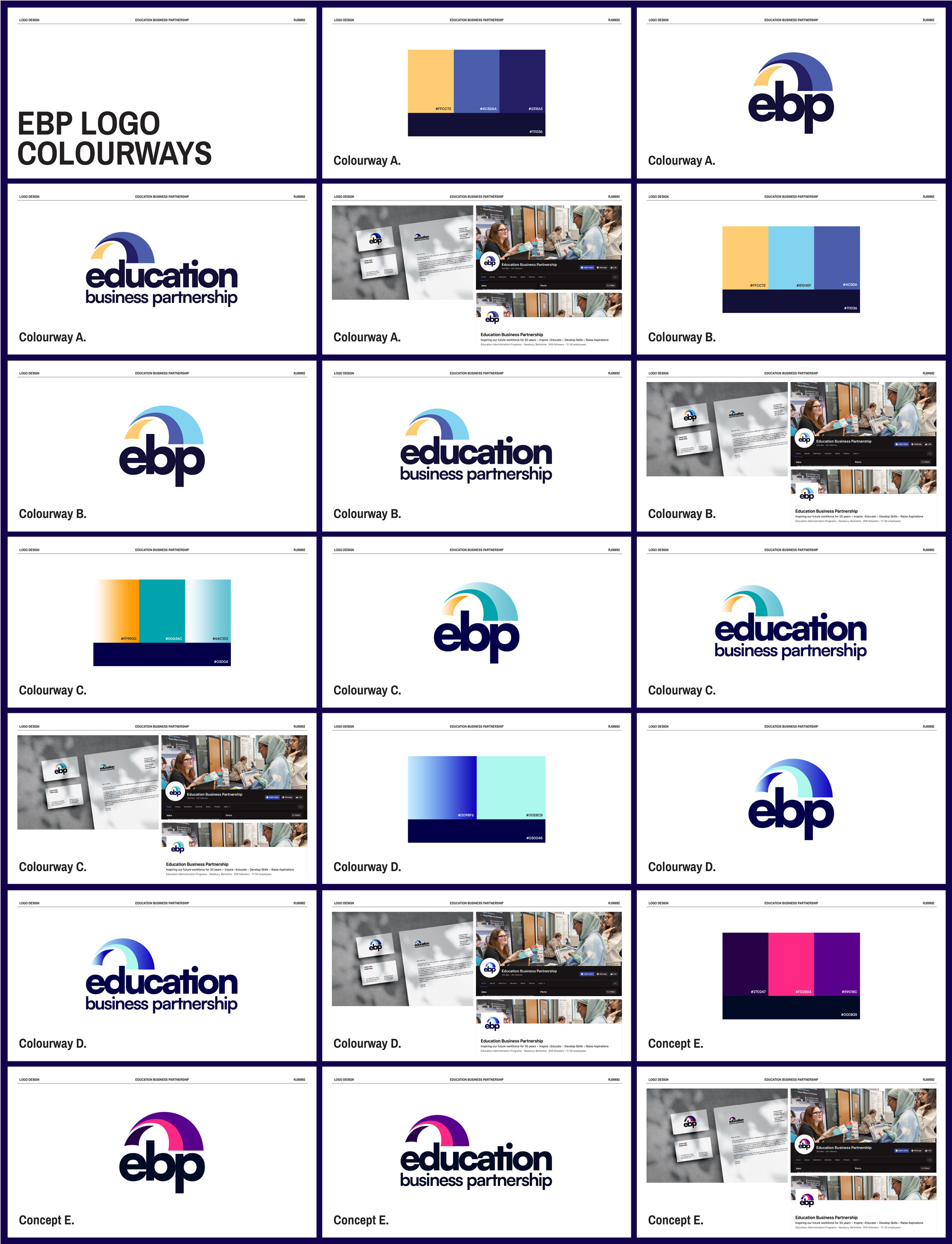
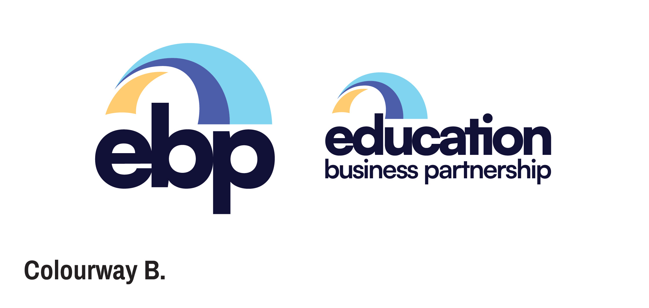
After finalising the logo formats and structure, we experimented with colour palettes and presented five options to the client. Concept B was selected as the final branding colourway.
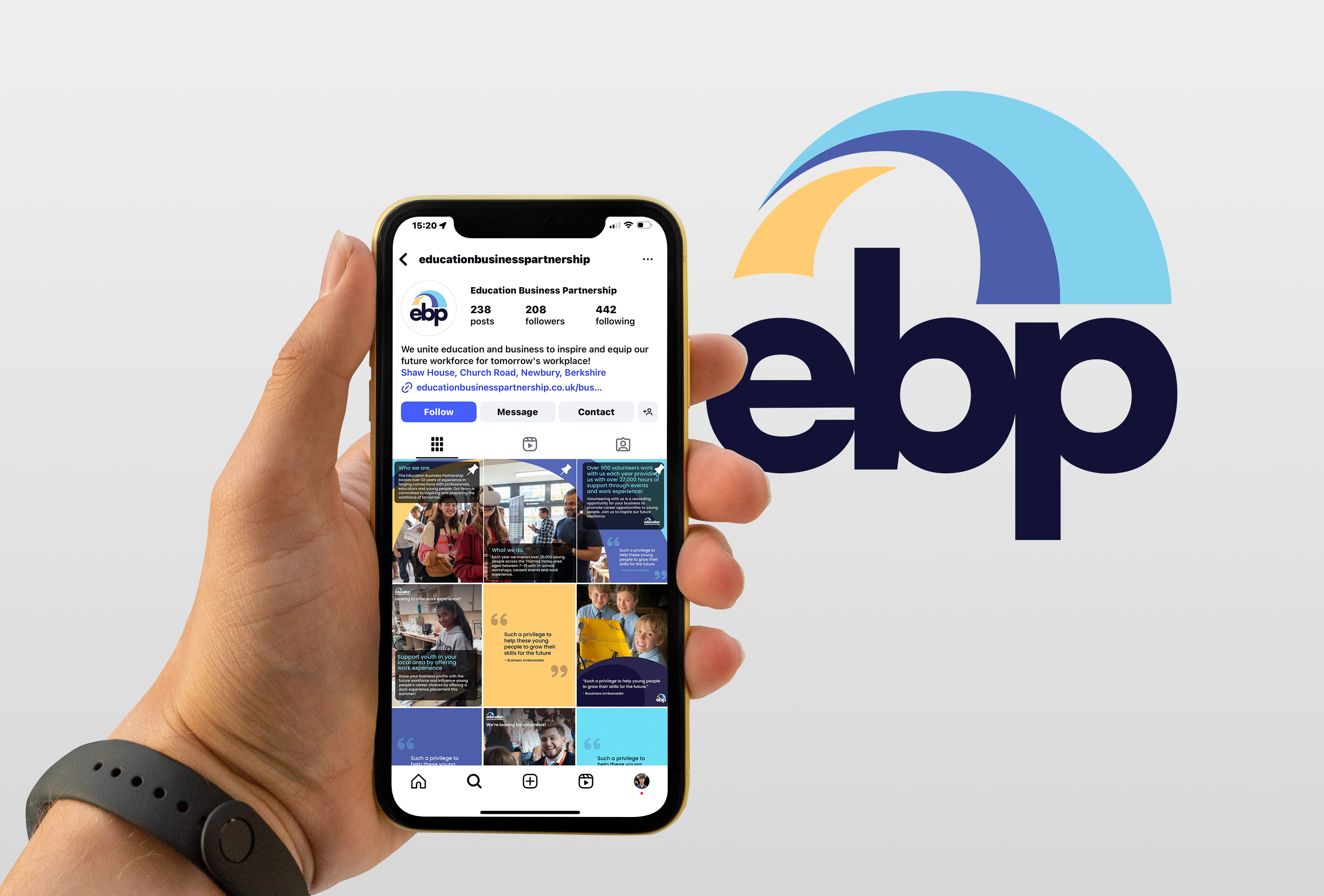
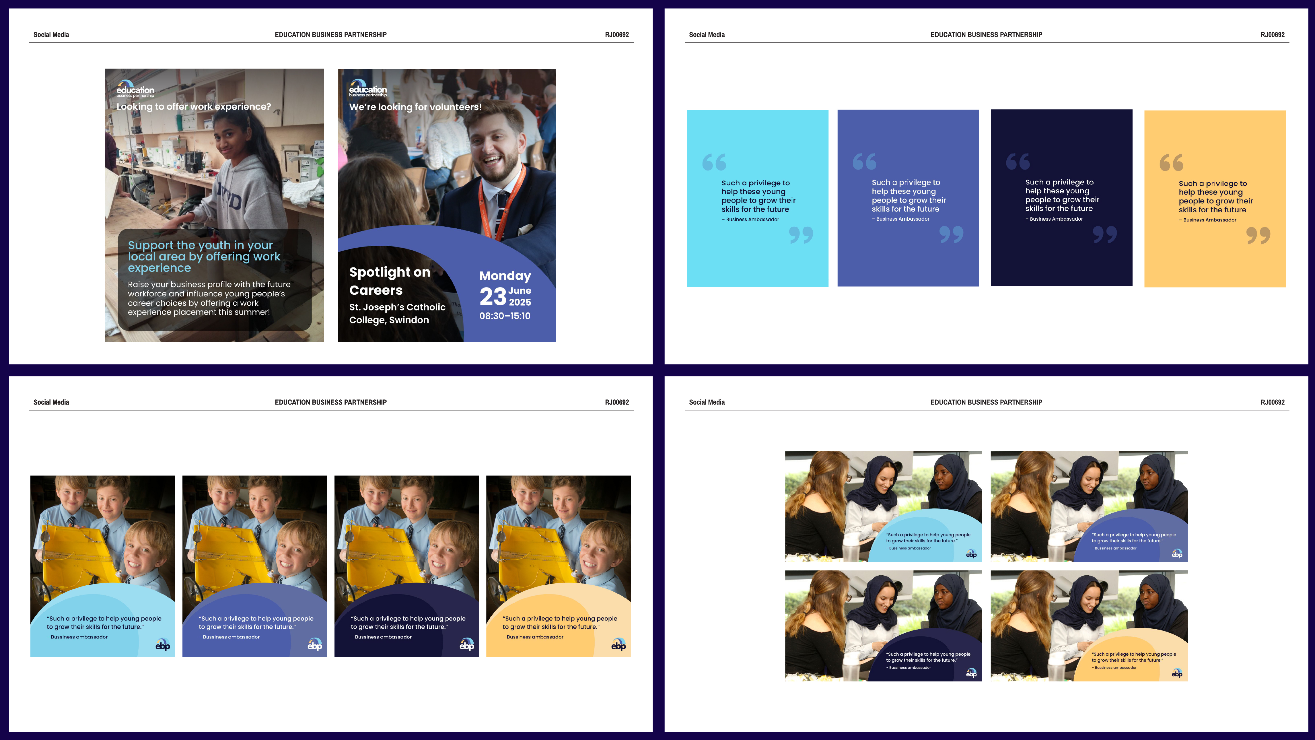
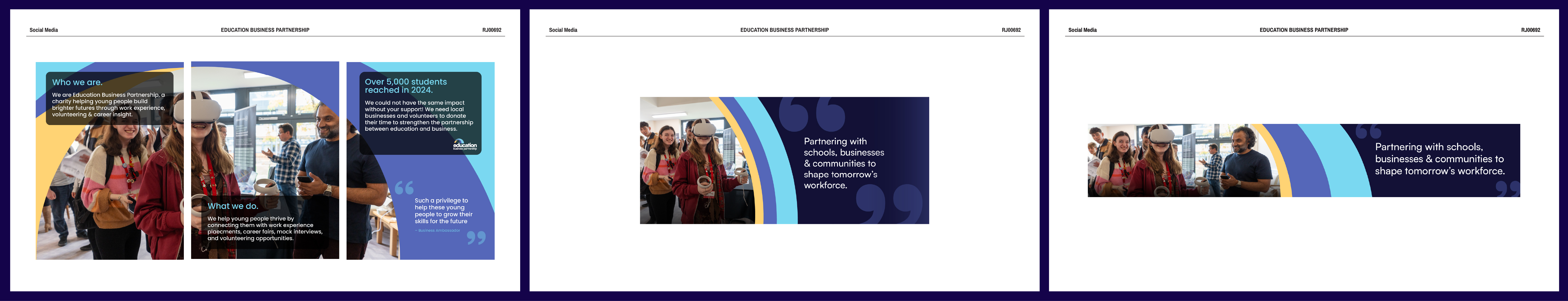
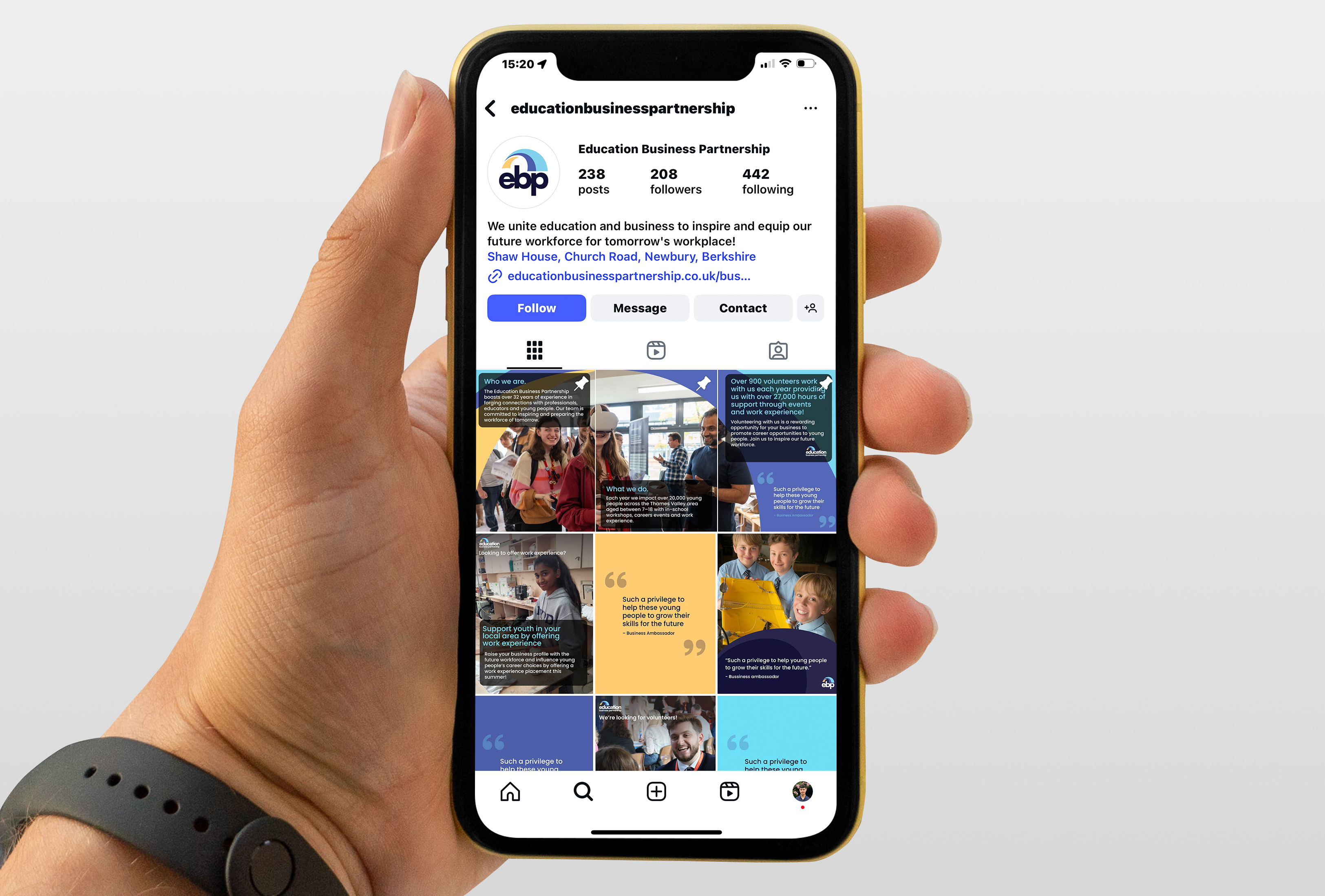
With the logos finalised, we turned to EBP’s social media, creating templates the client could use moving forward. Reviewing their existing channels revealed a need for posts to advertise volunteering events, showcase work experience opportunities, share stakeholder quotes, and display event photos. Templates were created for each in Canva. In addition to editable posts, we pitched three pinned Instagram posts and banners for LinkedIn and Facebook to serve as introductory assets for new visitors.
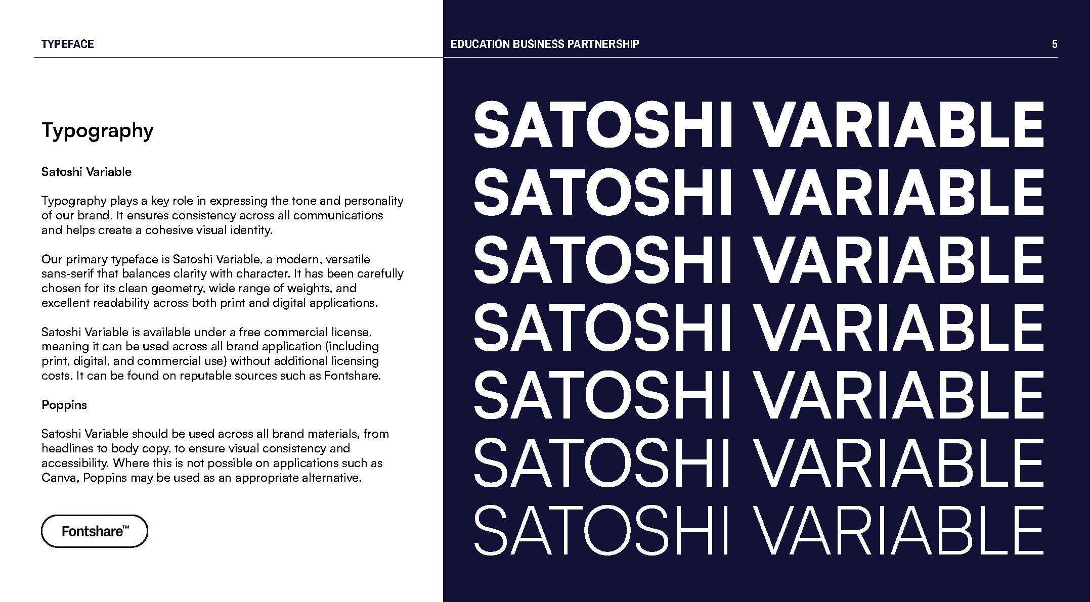
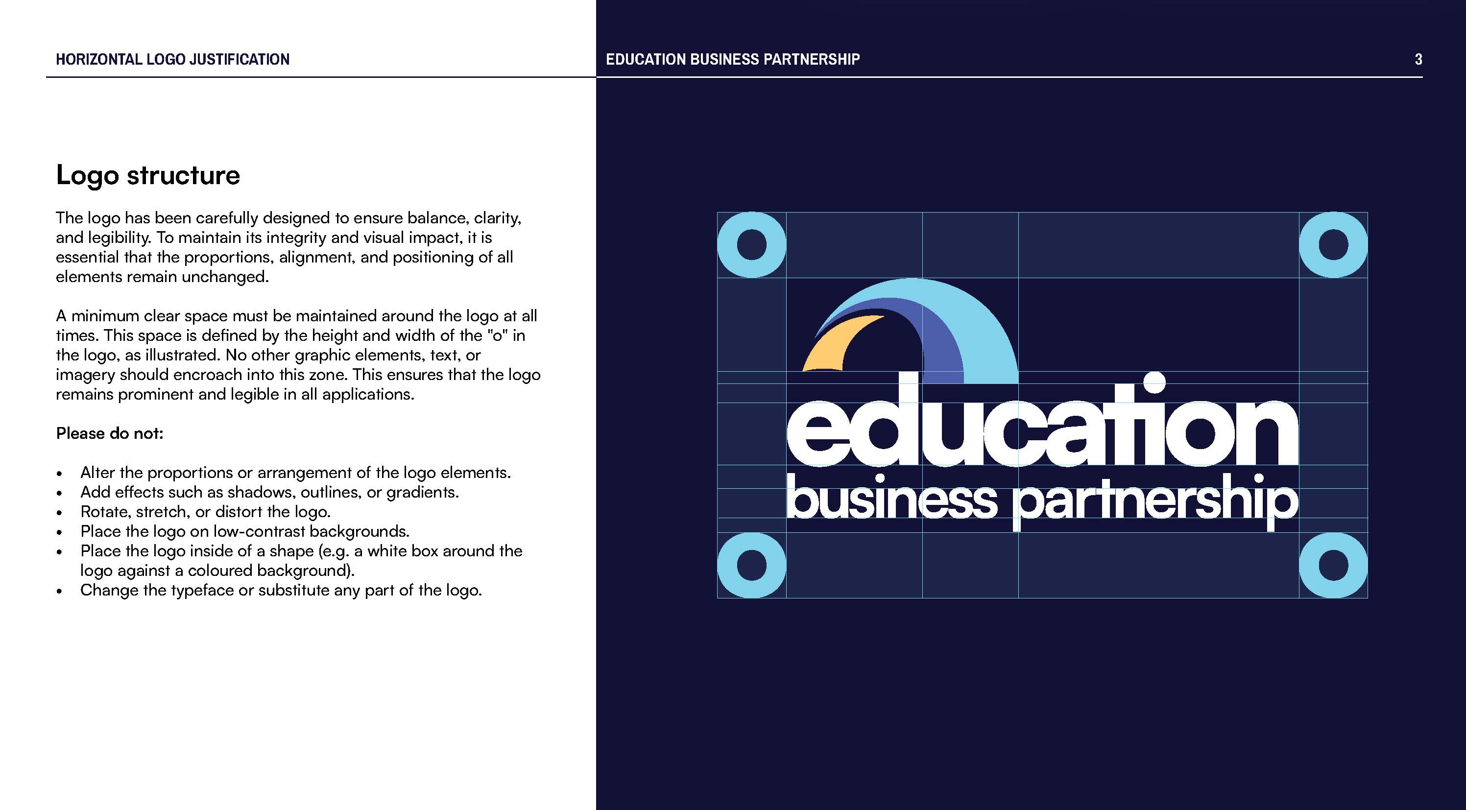
Once all deliverables were finalised, we compiled a brand guidelines document for the client, providing a reference for future use and for any designers involved in updating their website with the new brand identity.