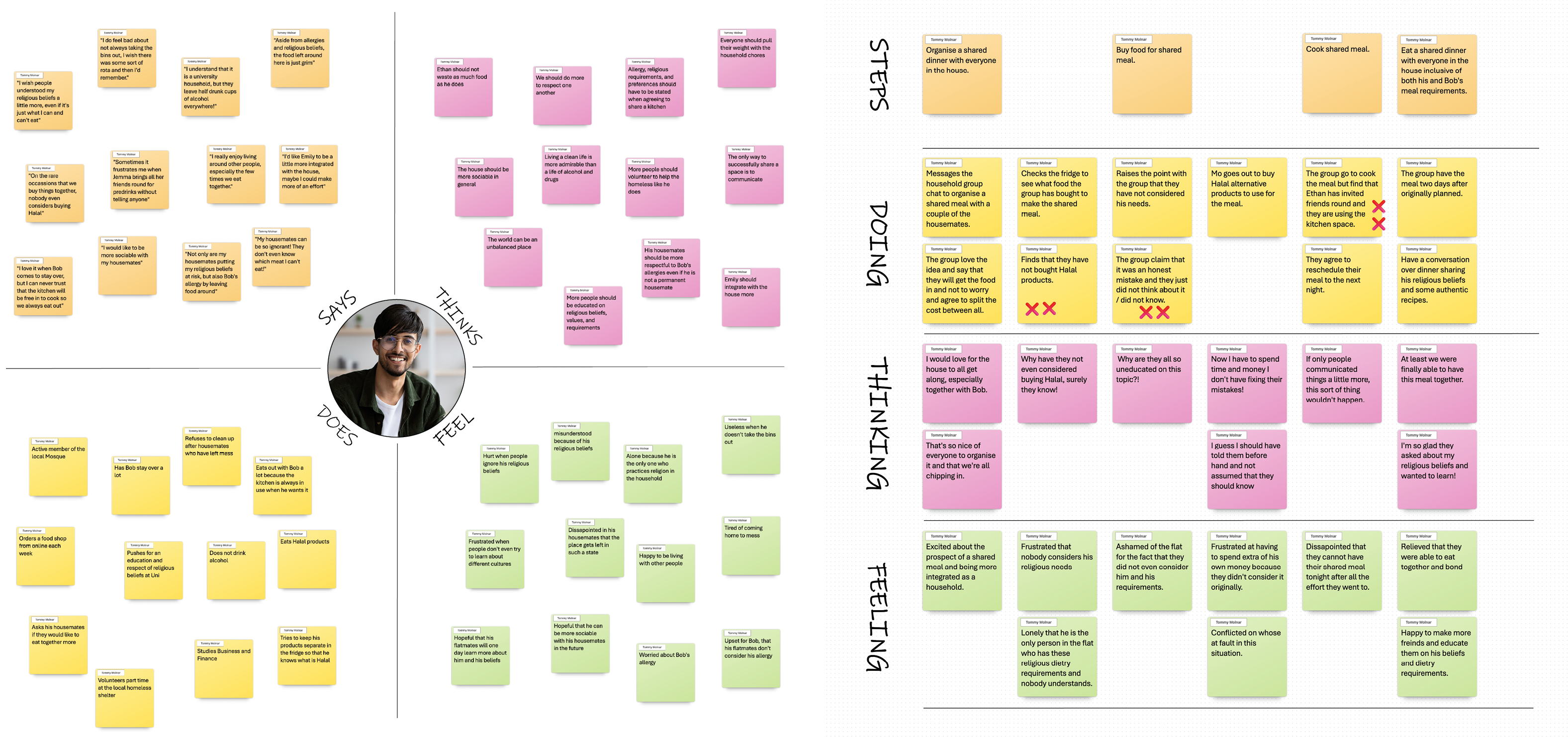
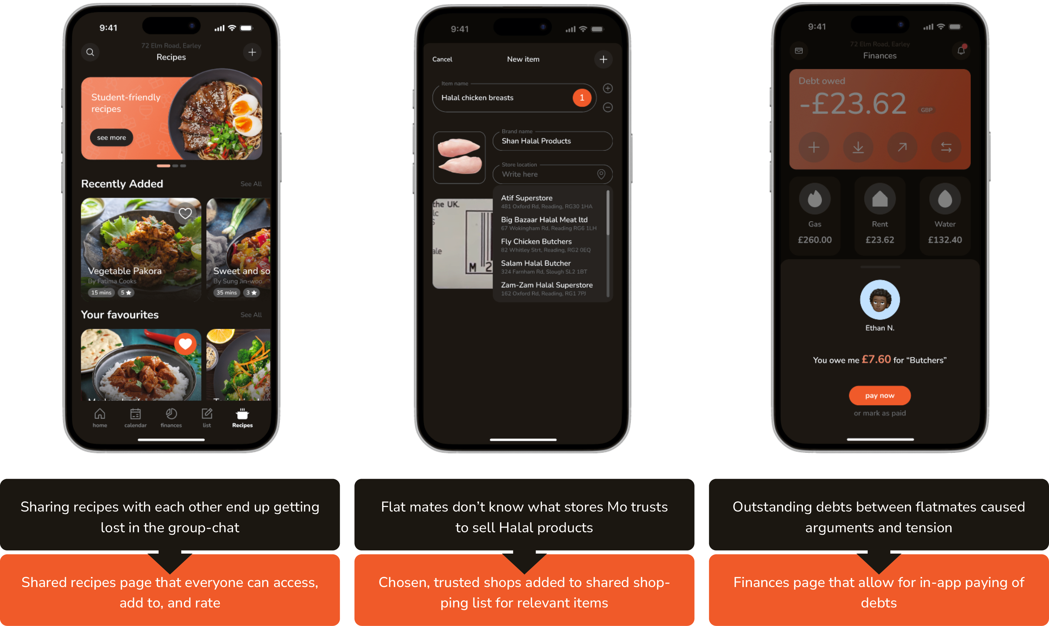
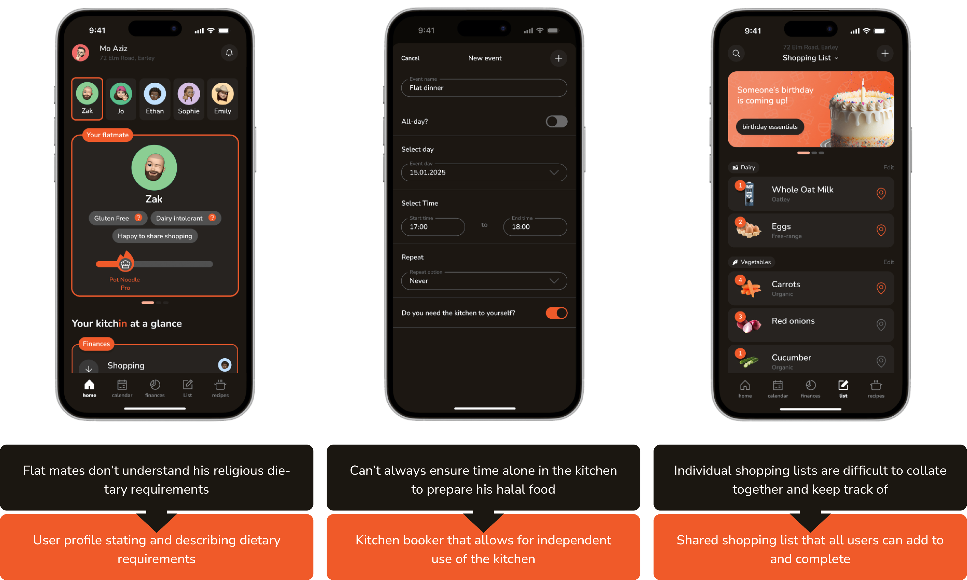
I conducted a deep dive into Mo’s life, journey, and pain points, which were consistently referenced throughout the app’s design process. An
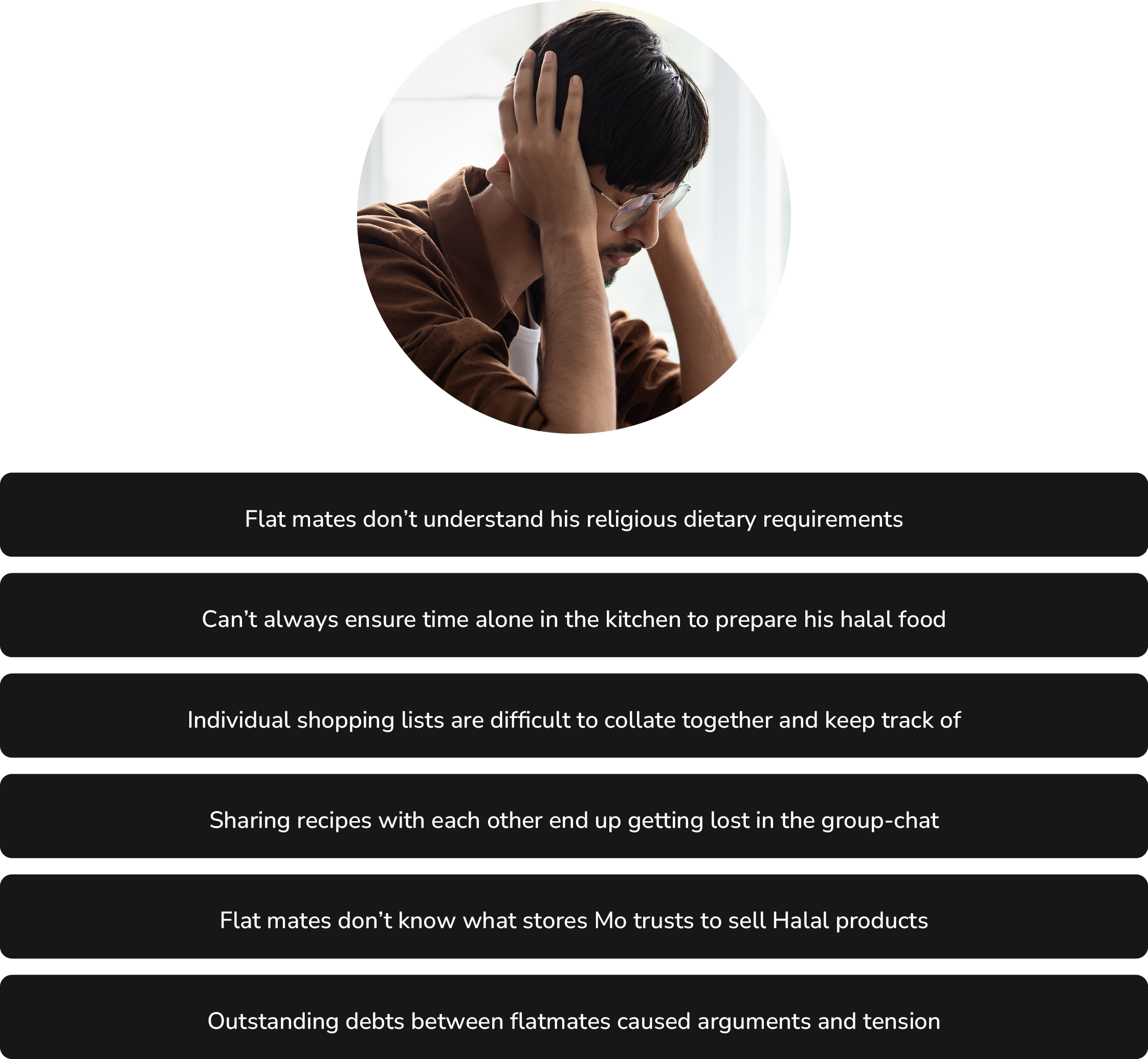
article on religious food choice among British Muslims by Owais, Patel, and Abbott (2024) revealed that important factors to consider for British Muslims when buying food are trusting infamiliar food providers, verification of halal authenticity, and abiding by Islamic Jurisprudence. This is important to consider in a shared environment, especially if the food he eats is not always bought directly by Mo himself.