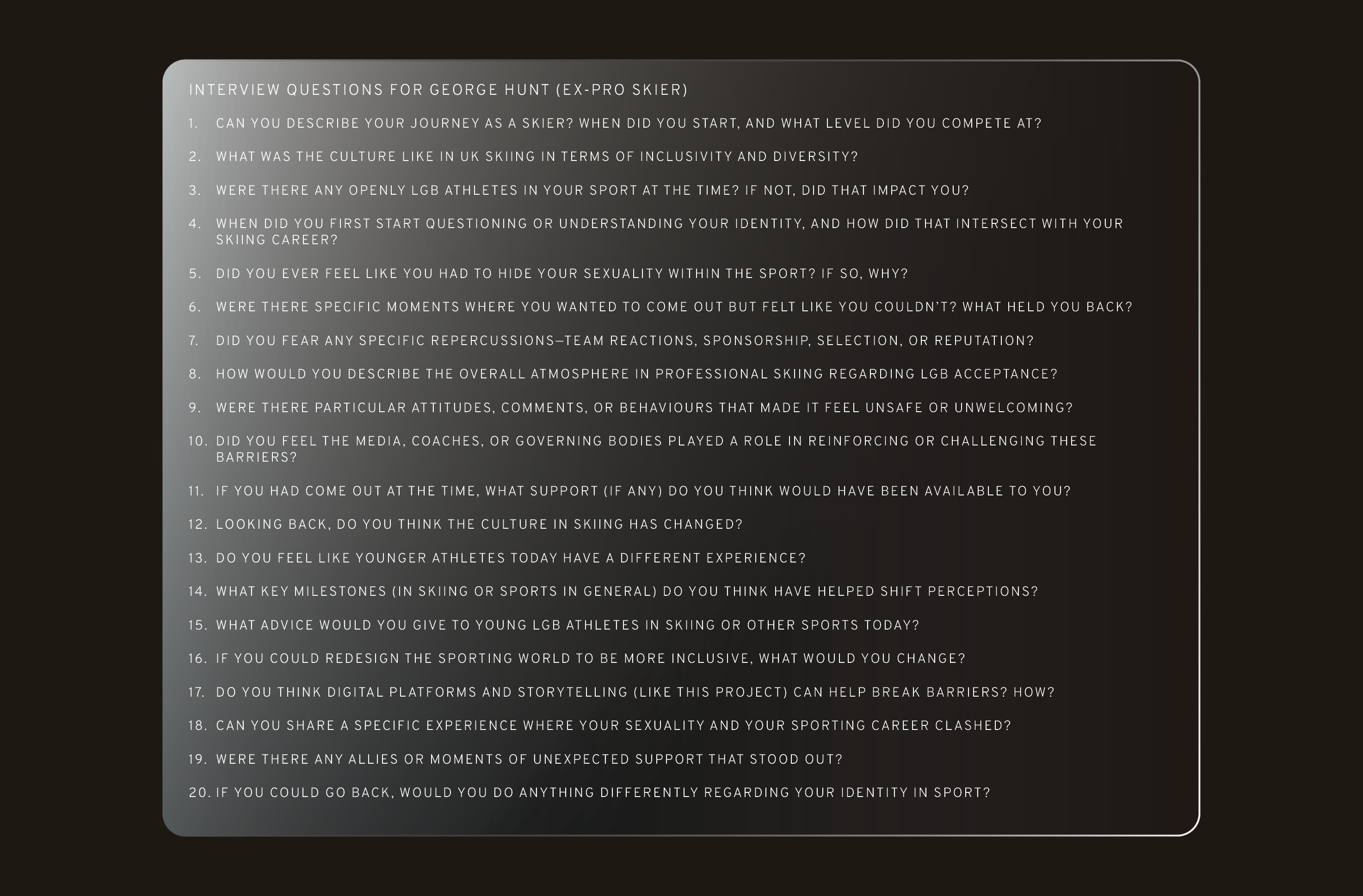
The first stage of research involved interviewing a queer sportsman. This exercise was invaluable in developing a deeper understanding of the user, while also providing an insightful and engaging conversation. I went on to research athletes who had come out publicly, examining the media coverage, online articles, social media posts, and general public responses that followed.
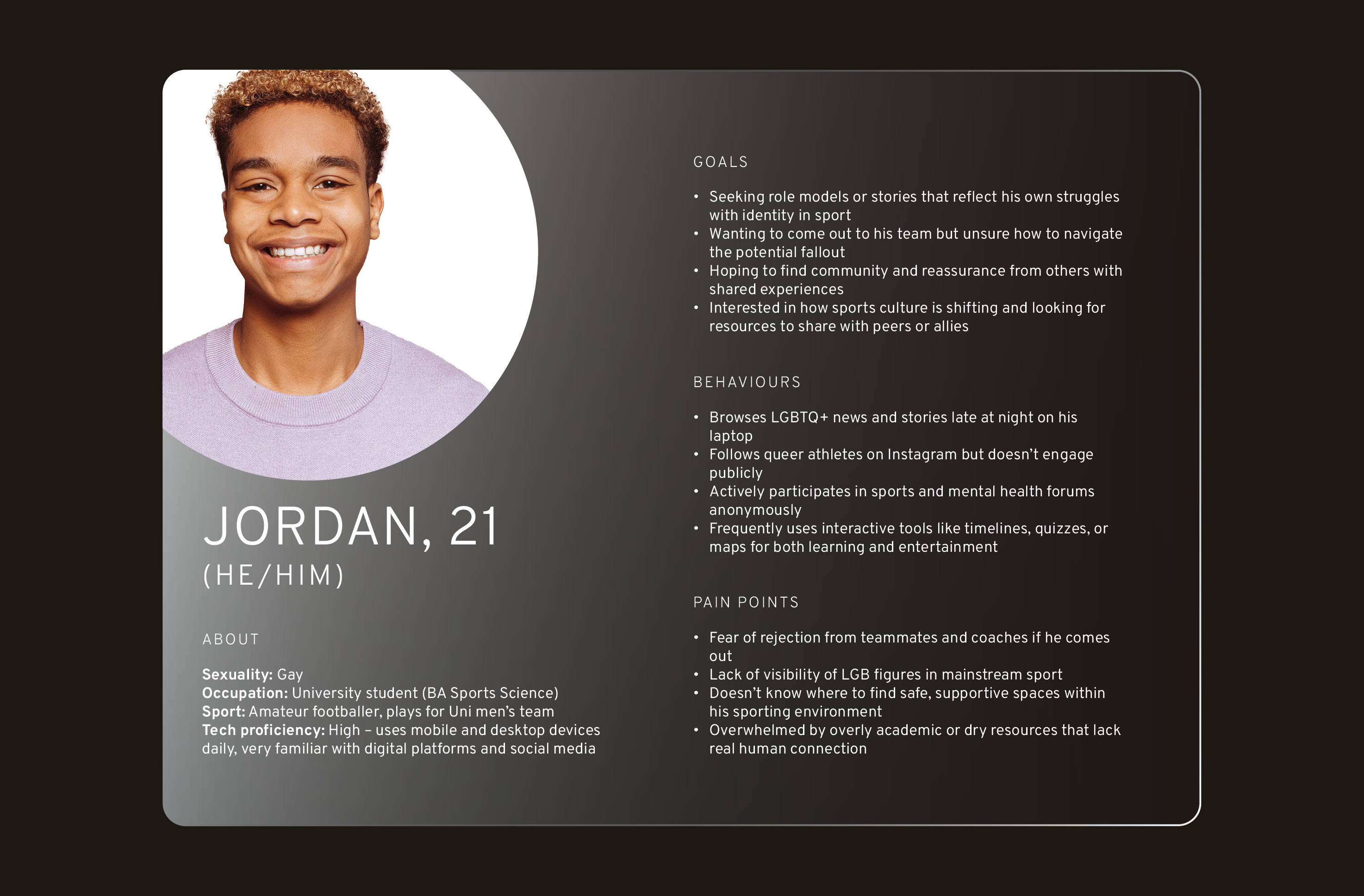
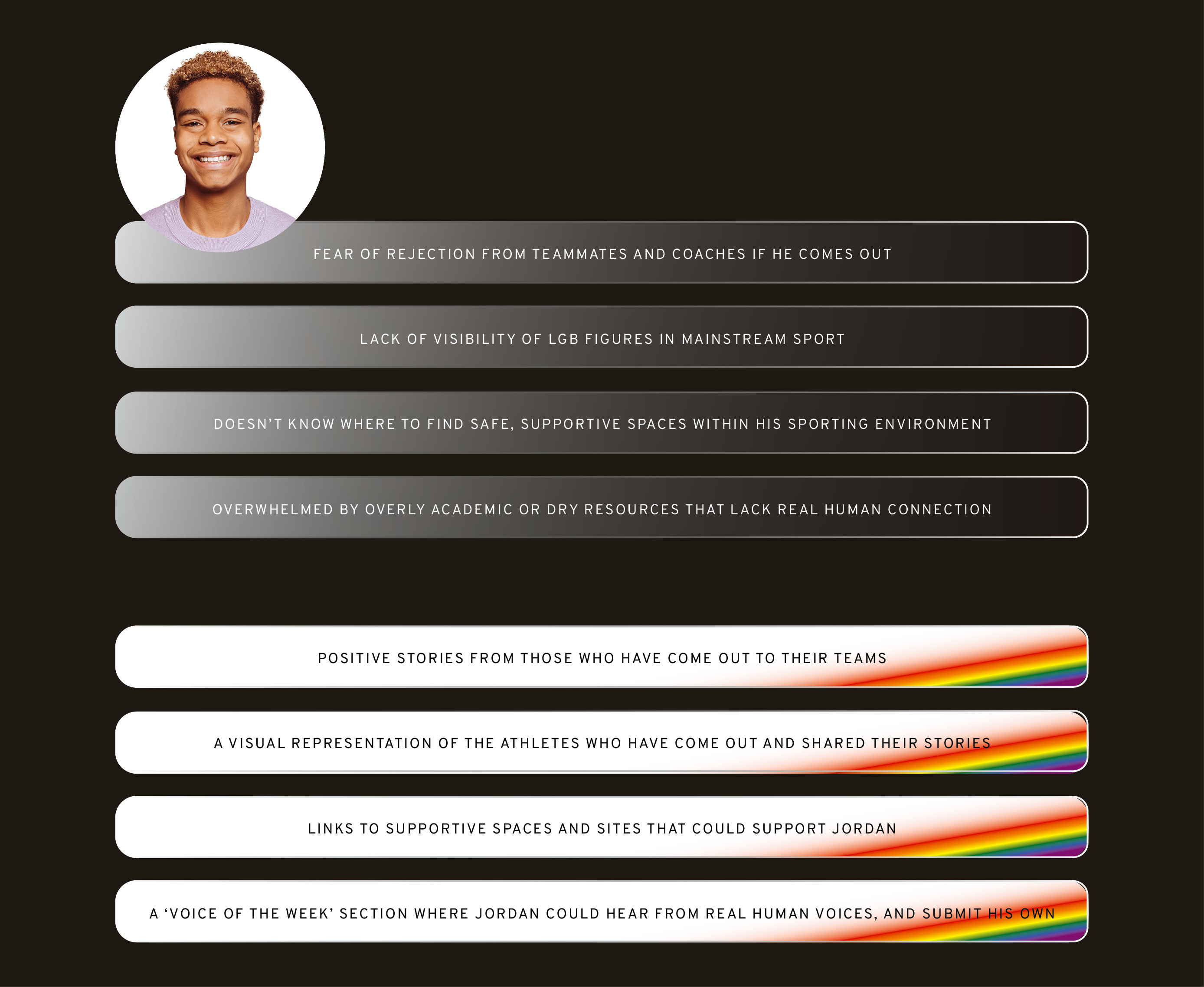
I carried out a deep dive into Jordan, a developed user persona, to better understand his pain points and how the site could help to alleviate them. This included exploring a ‘day in the life’ of Jordan, as well as defining ten words the client wanted associated with the site’s design.
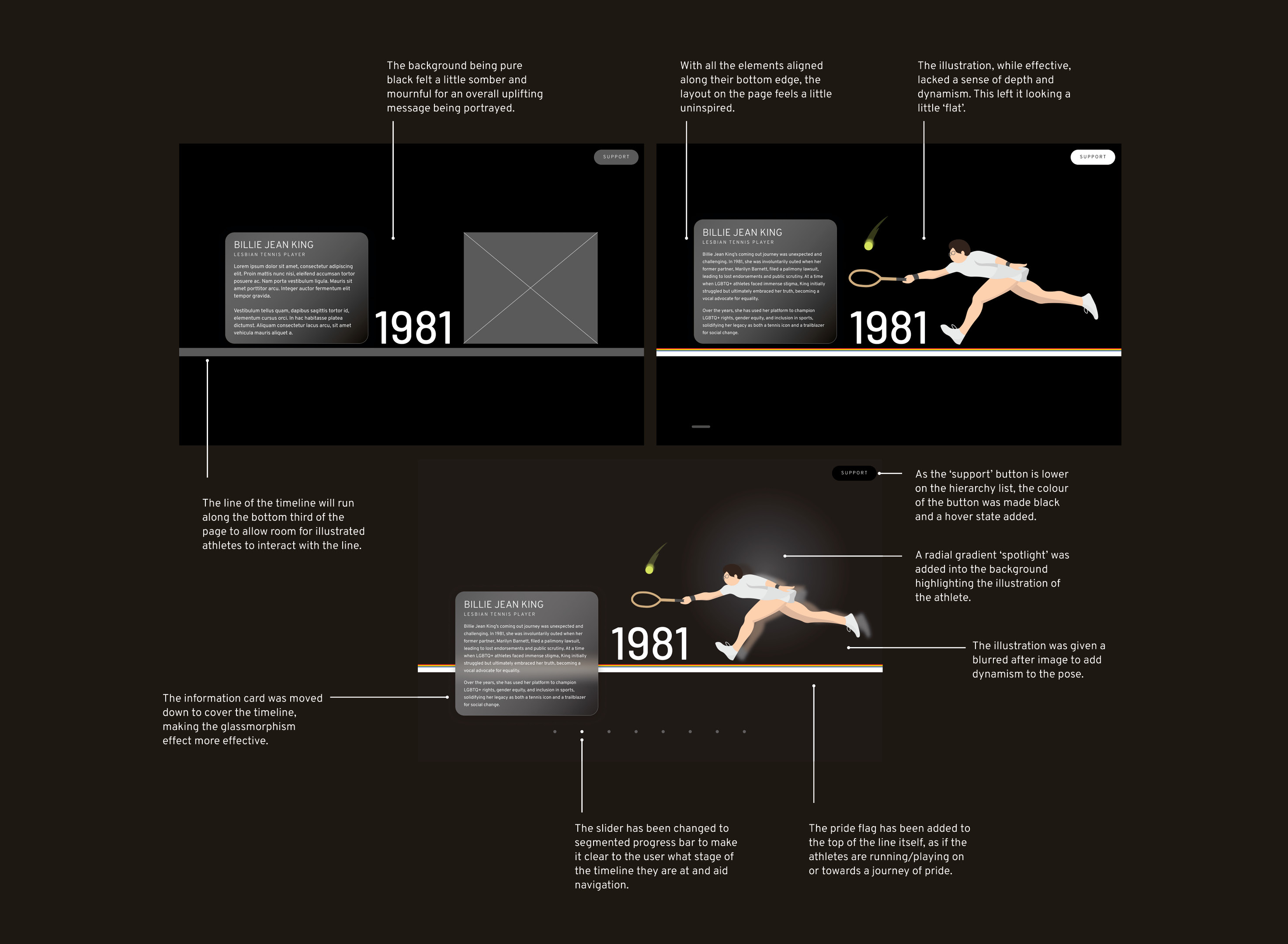
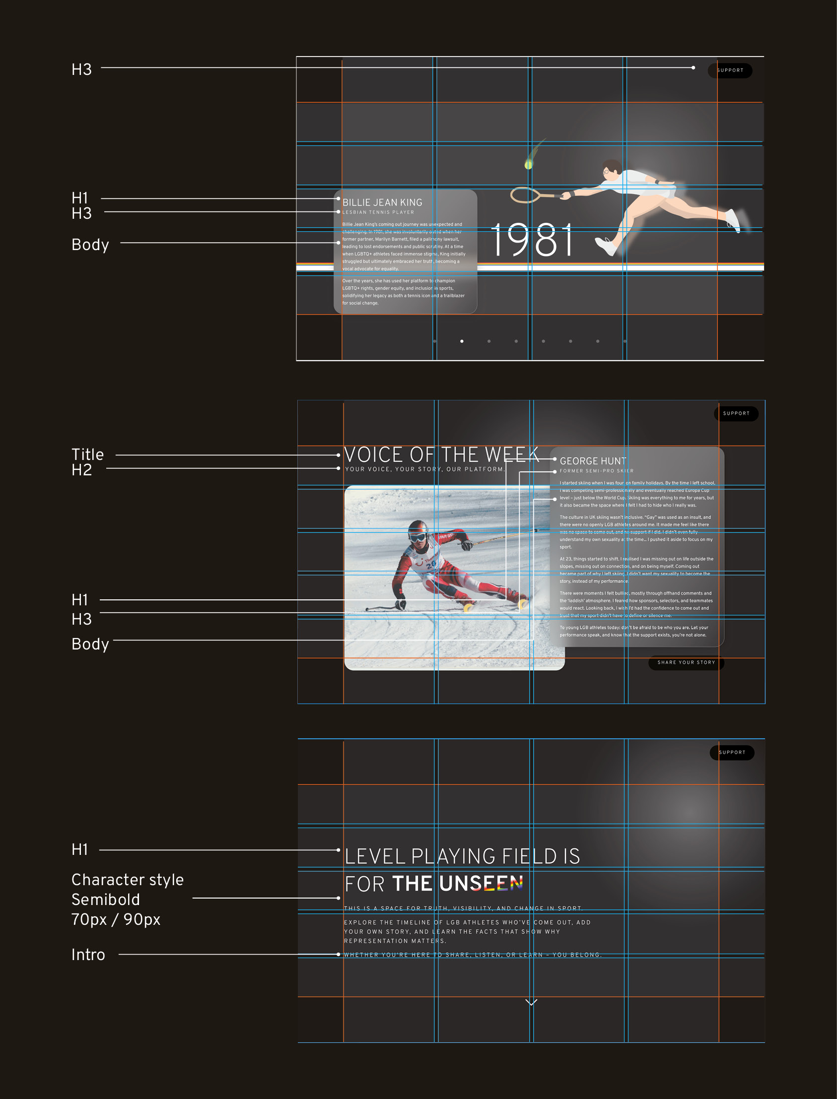
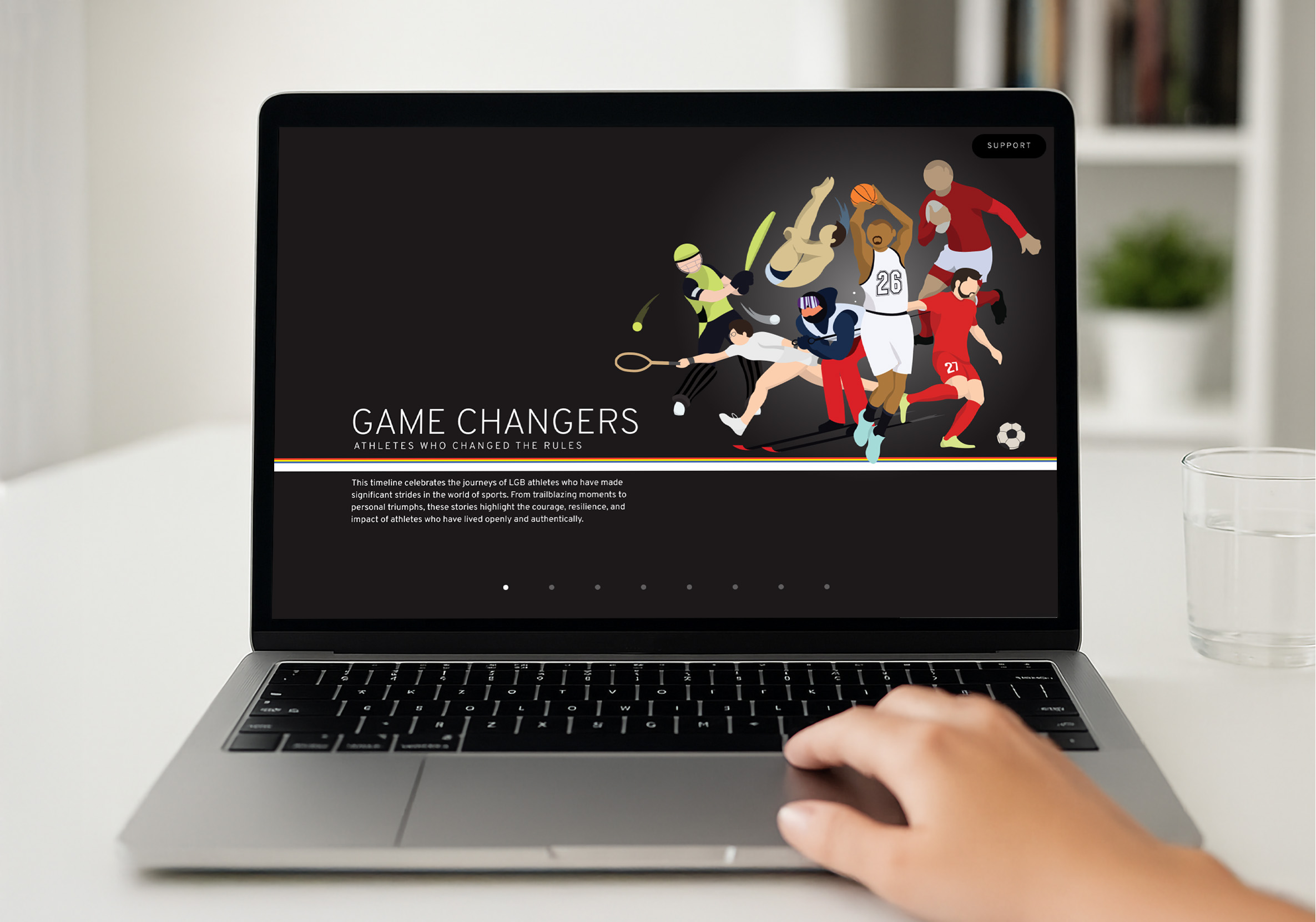
The interfaces went through several iterations before reaching the final design. Custom illustrations of famous athletes were created as focal visuals, while content was placed in containers with a glassmorphism effect to keep the site feeling contemporary.
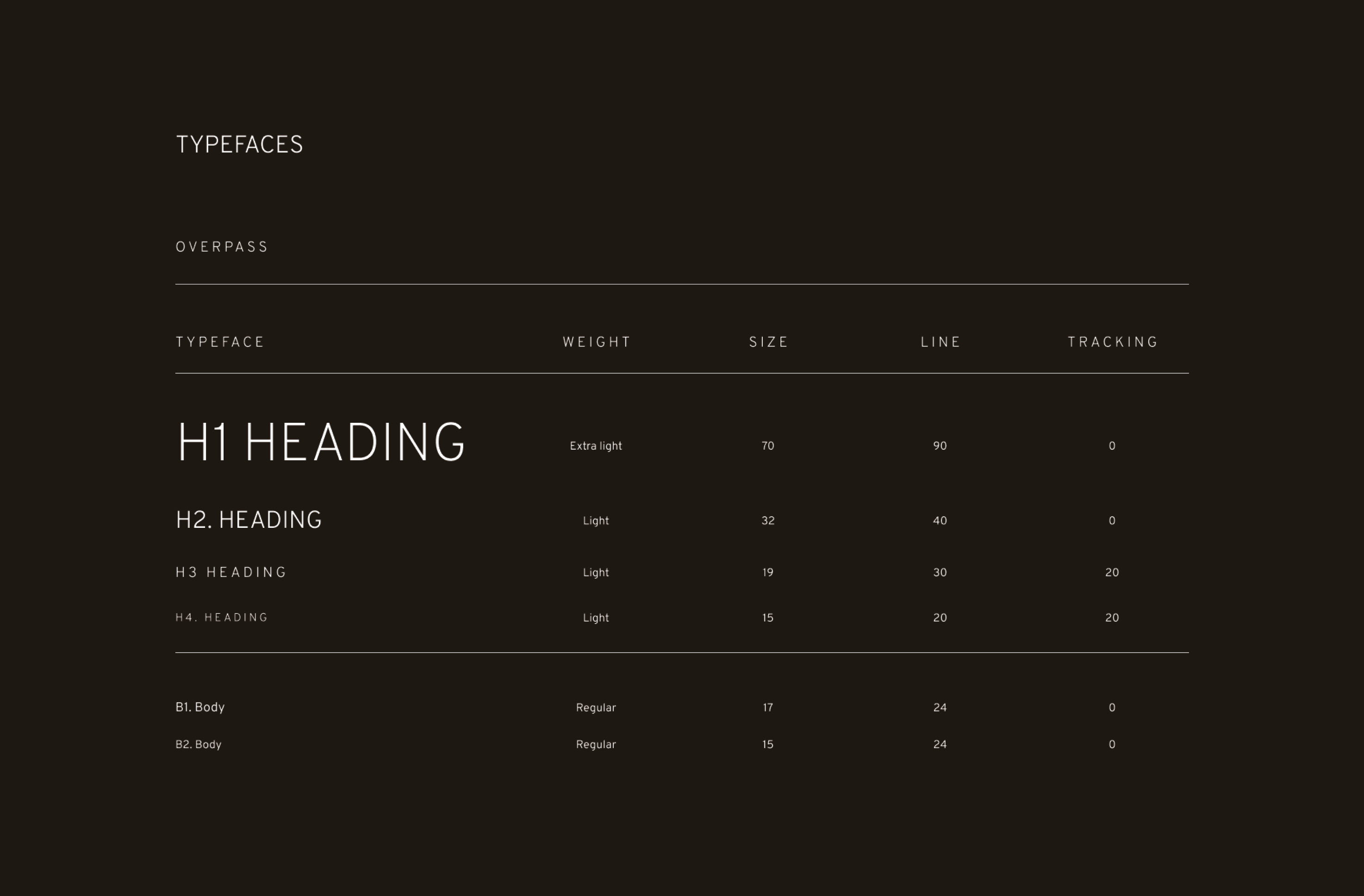
The choice of Overpass as the typeface was both functional and symbolic. Designed by Delve Withrington, a queer type designer, it embeds LGBTQ+ representation directly into the site’s visual identity while also offering clarity and versatility.
It was important that the site remained structured, as its purpose is to inform and educate. The design was kept clean and simple, with minimal navigation and no unnecessary distractions.
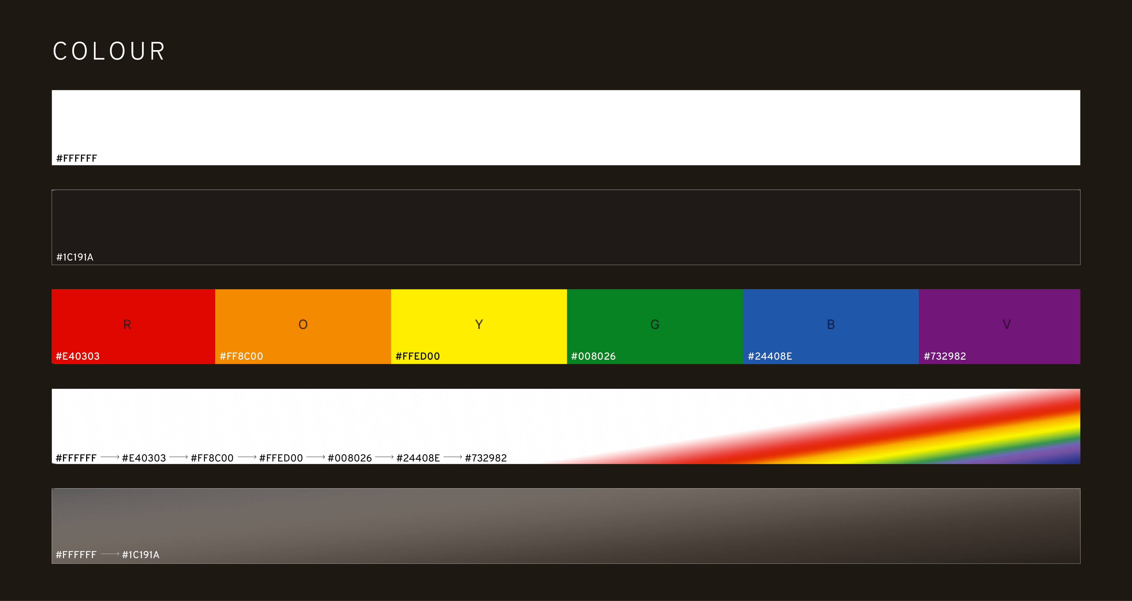
The colour scheme balances light and dark with the colours of the pride flag. Two gradients are used throughout: a white-to-black glassmorphism gradient and a rainbow-to-white gradient. The dark background with light foreground, spotlights, and pops of pride colours represents athletes coming out and shining in a world not always made for them.
Subtle interactions like parallax scrolling and animated UI elements add a sense of movement, reinforcing the theme of sport while supporting the content. Level Playing Field creates a space for LGB users to feel seen, heard, and supported, helping users like Jordan feel more understood, informed, and confident on and off the field.