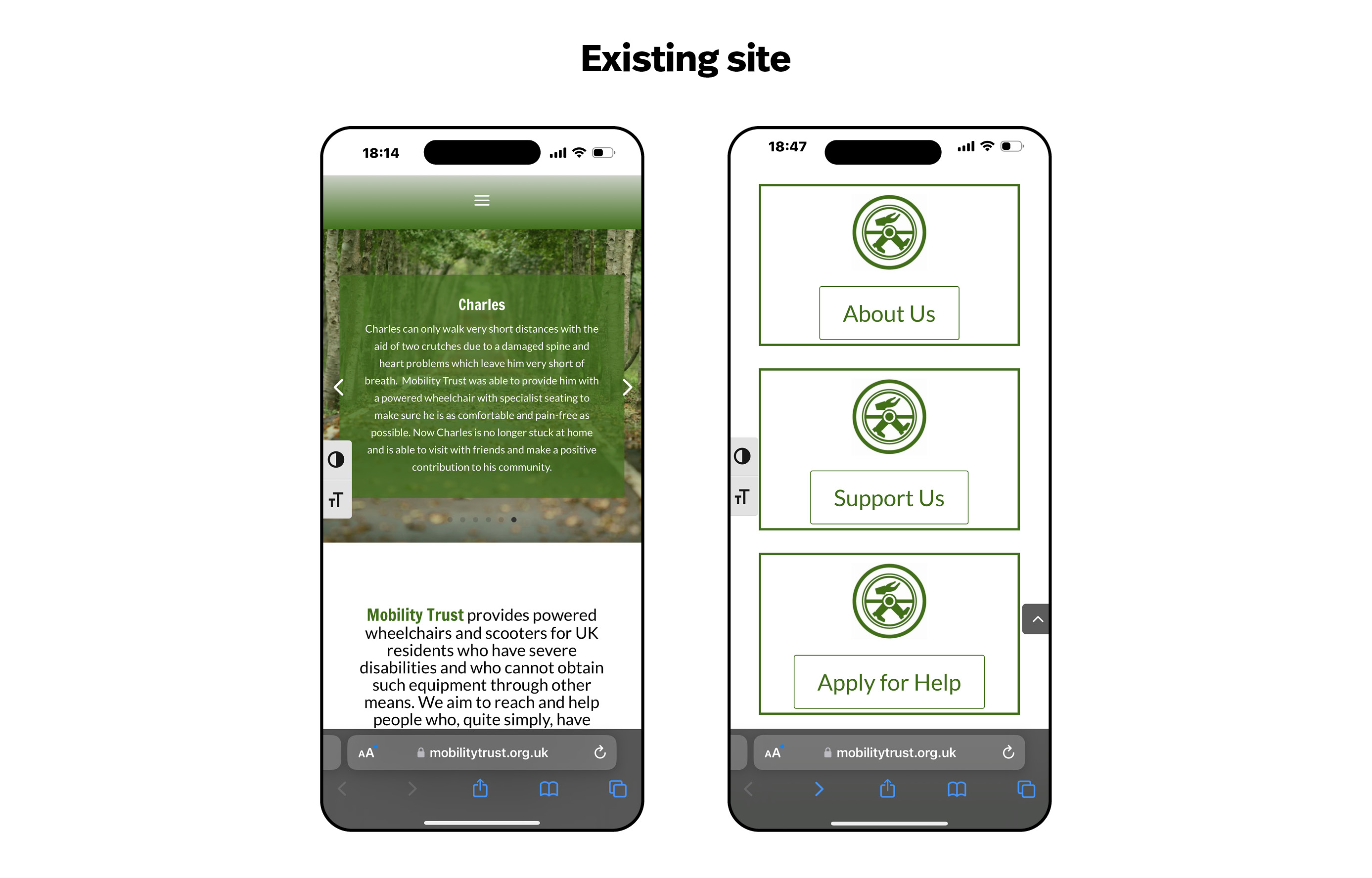
The original Mobility Trust mobile site – while functional – did not encourage an ideal user flow, with the donation journey hidden behind multiple clicks. Visually, the design also felt outdated and lacked the sense of trust and credibility that a charity’s site should convey.
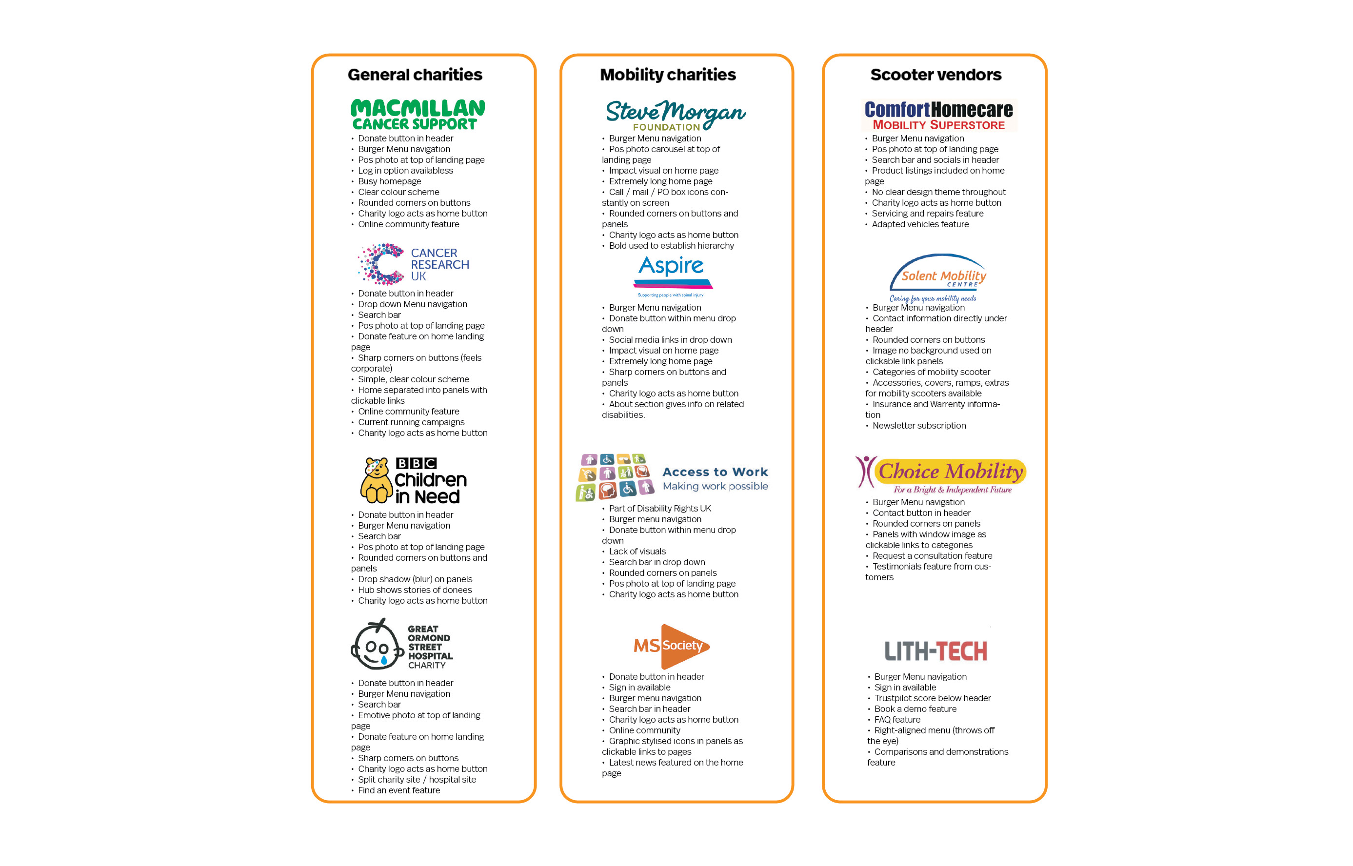
My research then turned to comparators, including other charities and mobility scooter vendors, which informed the development of a diverse range of user personas for Mobility Trust.
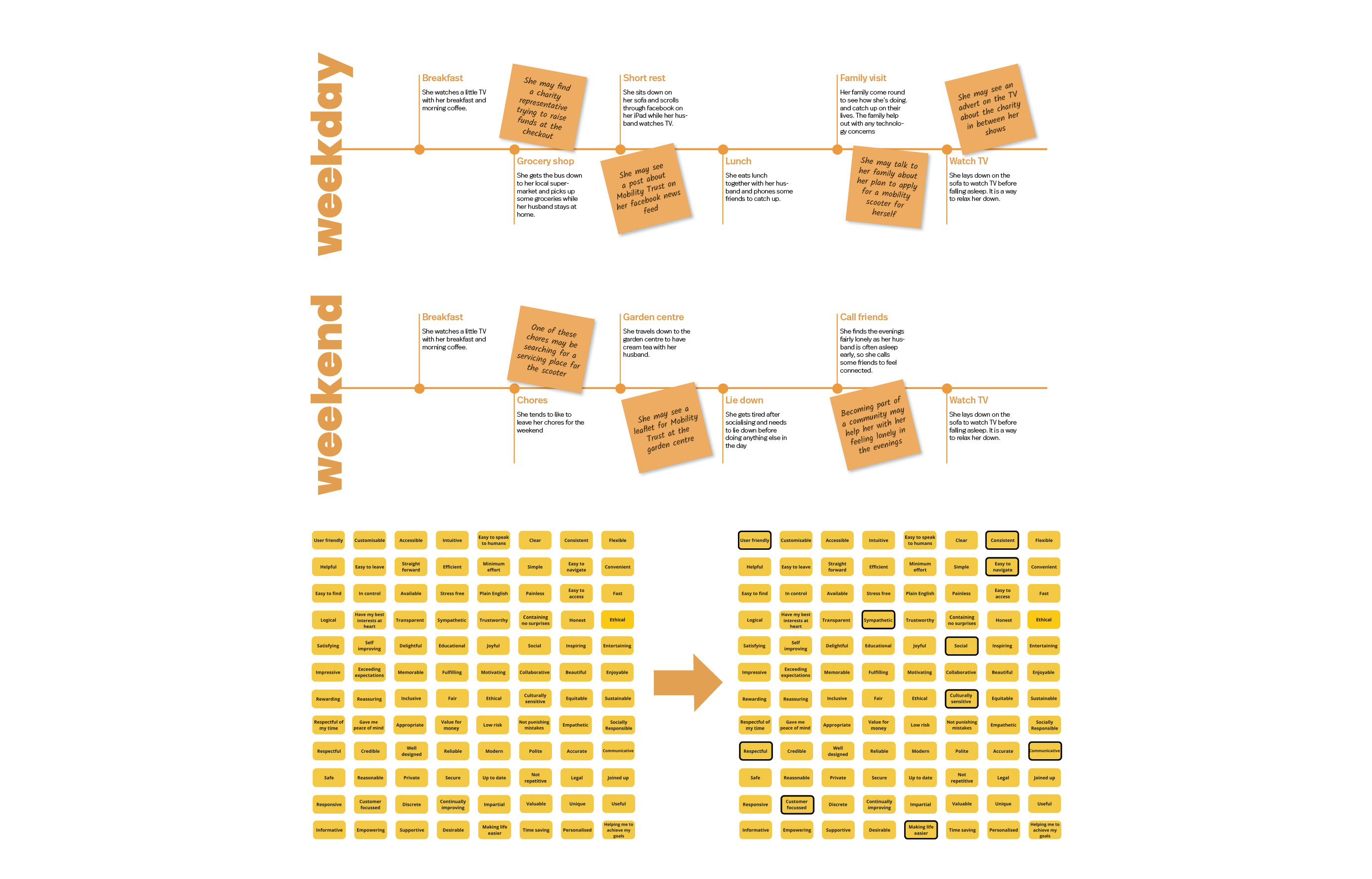
By conducting a ‘day in the life’ study of one user persona, alongside creating a value proposition diagram, I was able to identify the key interfaces and features needed to make the user journey simpler and more effective.
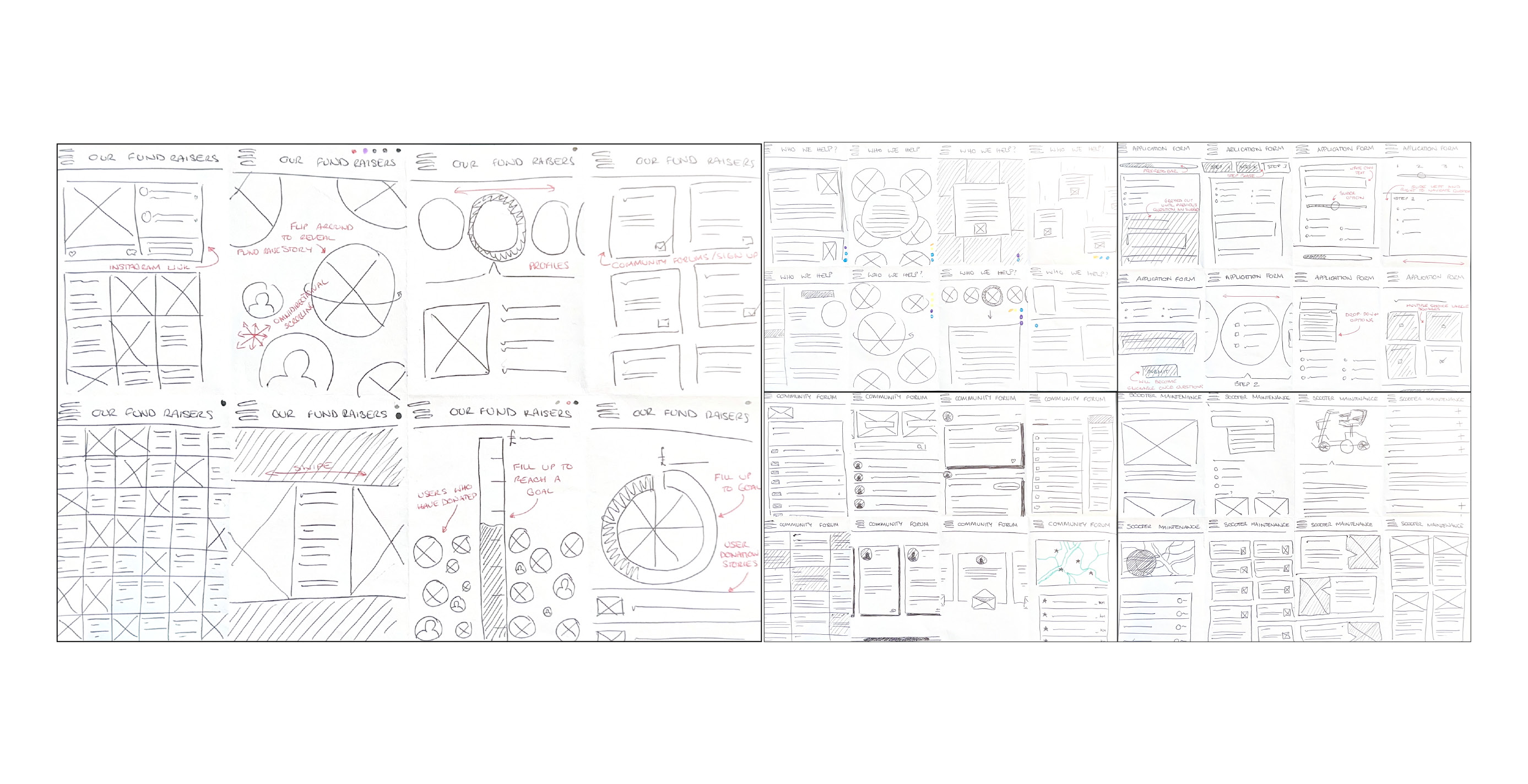
Using the ‘Crazy Eights’ technique, I produced several quick sketches which were then dot-voted by designers and potential users to identify the most appropriate interface designs.
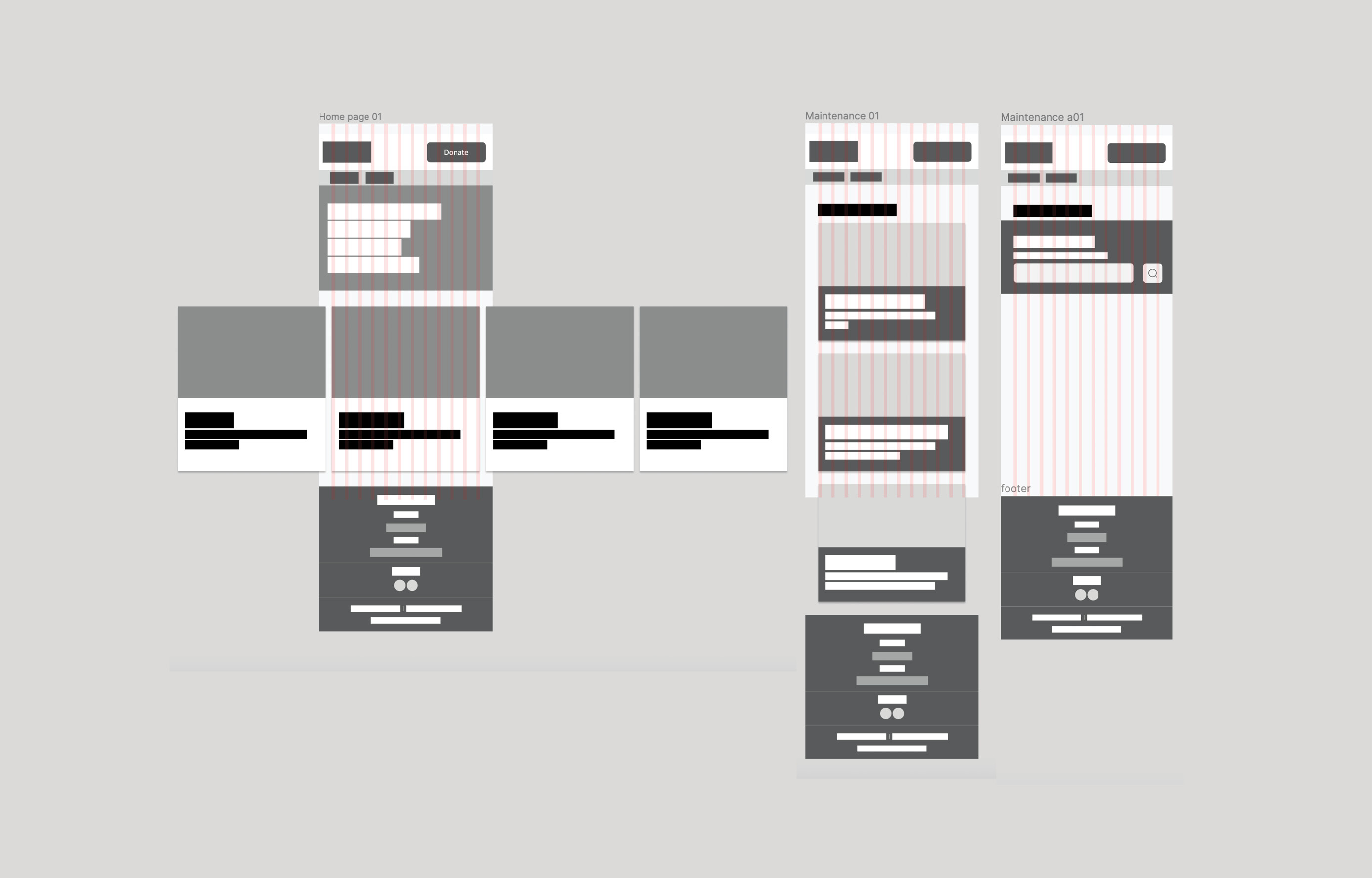
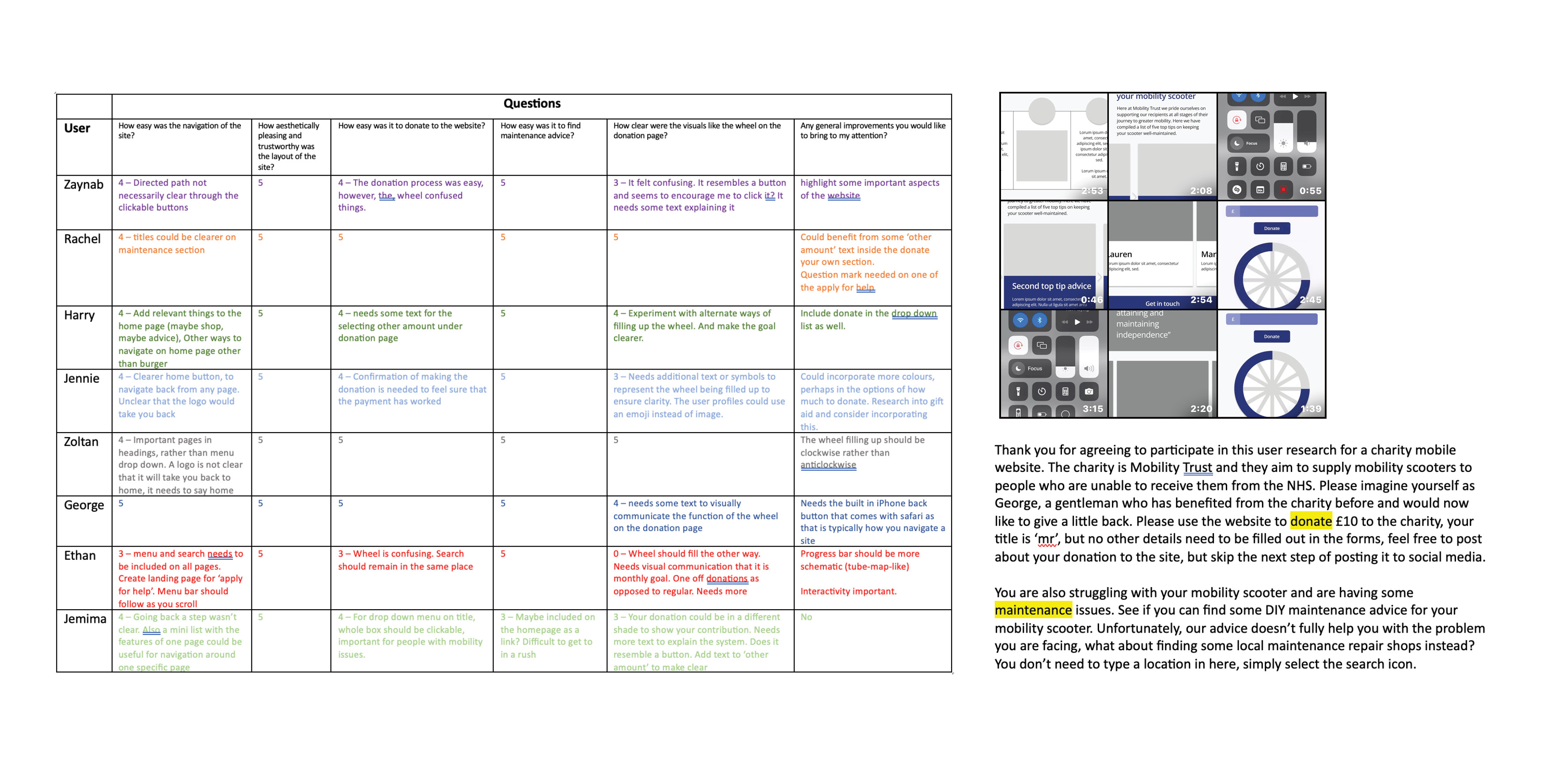
Once the interface designs were decided, the next stage was wireframing. After adding draft copy to the wireframes, I gathered initial user feedback to test the journey and ensure it met user needs effectively. This research shaped the further development of the screens as seen below.
As with every project I work on, typography and hierarchy were carefully considered. I chose a typeface designed for screens, with open counters and a generous x-height for legibility, and used spacing to make the hierarchy clear and intuitive.
The redesign of the Mobility Trust mobile site improved usability, modernised the visual identity, and streamlined the donation journey. Through research, user personas, and competitor analysis, the project delivered a clean, accessible, and trustworthy interface that meets the needs of both donors and service users.