A gap in the health app market was identified for chiropractic practitioners who are looking to set up a new clinic.
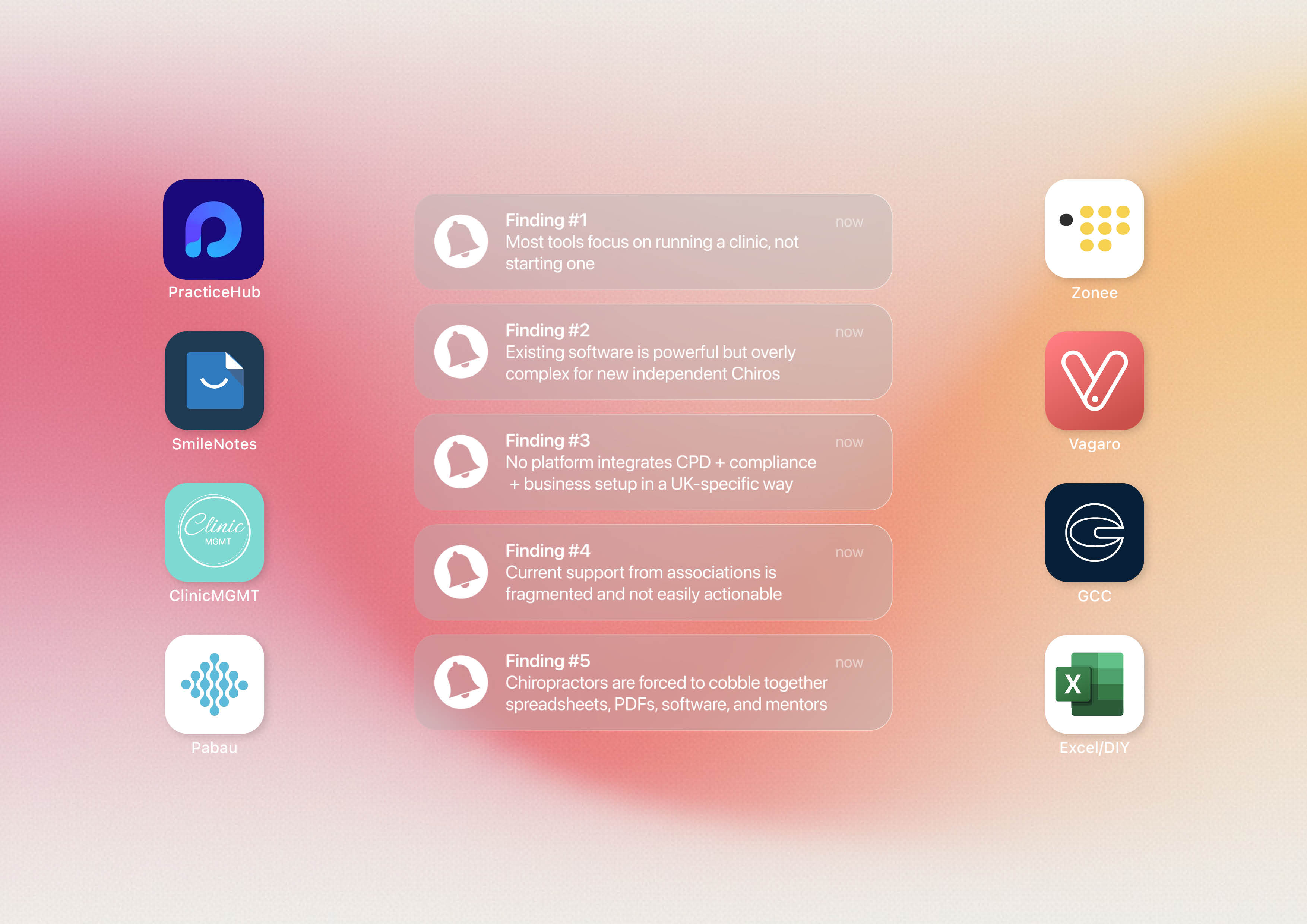
Most existing chiropractic platforms, such as Practice Hub, focus primarily on day to day clinic and patient management for established practices. They are designed to support practitioners who already have systems in place, rather than guiding newly qualified chiropractors through the complexities of setting up and running an independent clinic from scratch.
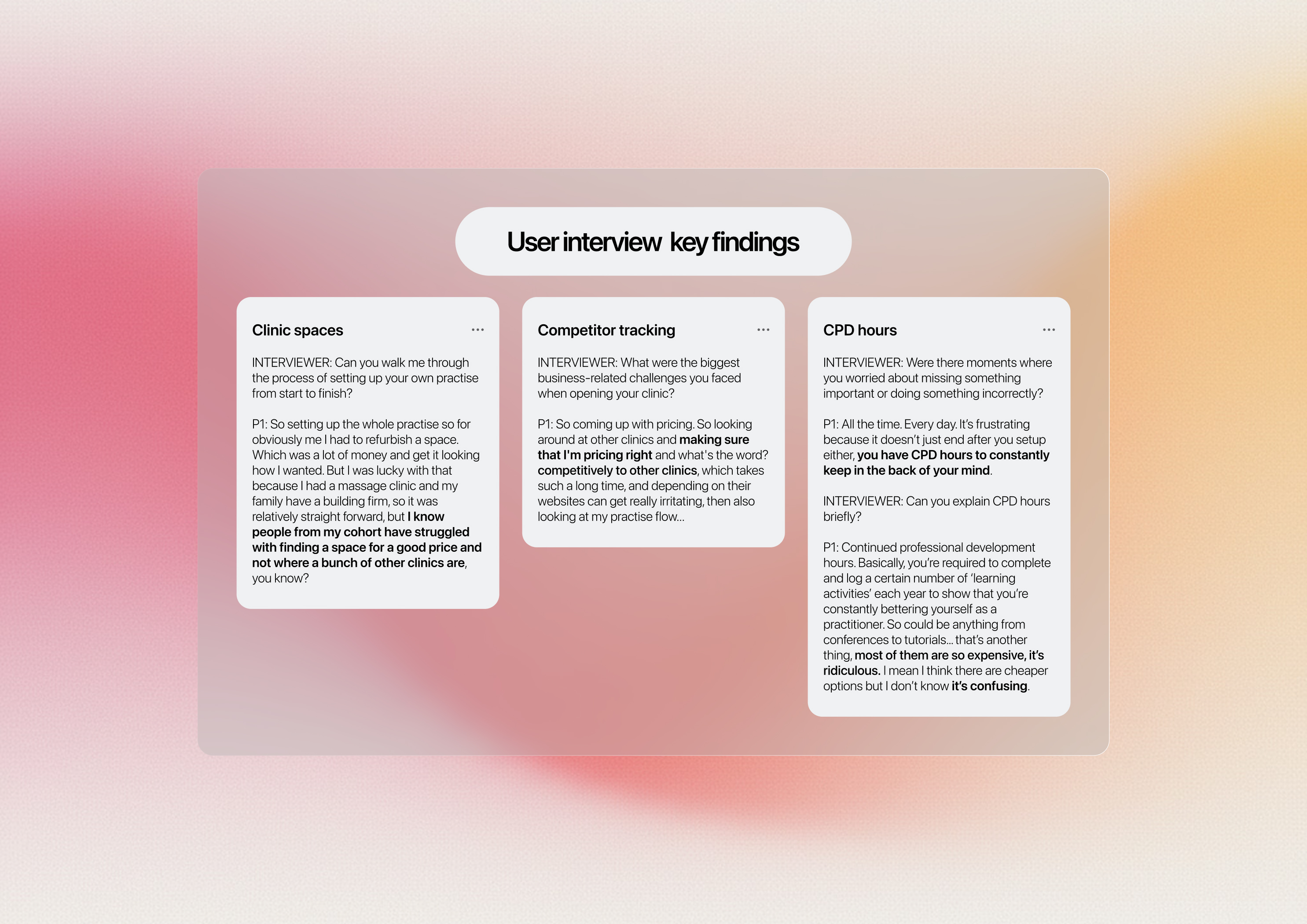
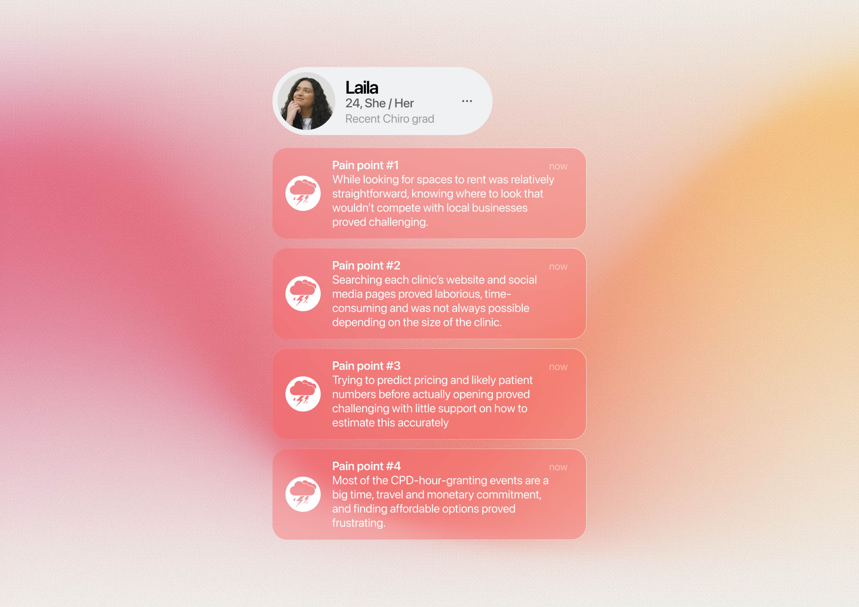
User interviews dictated the direction the app would take, ensuring it focused on the real needs of users. The findings highlighted three main concerns: the difficulty of finding suitable clinic spaces, the labour-intensive nature of tracking competitors and staying ahead of the market, and the frustration of finding and logging CPD learning activity hours.
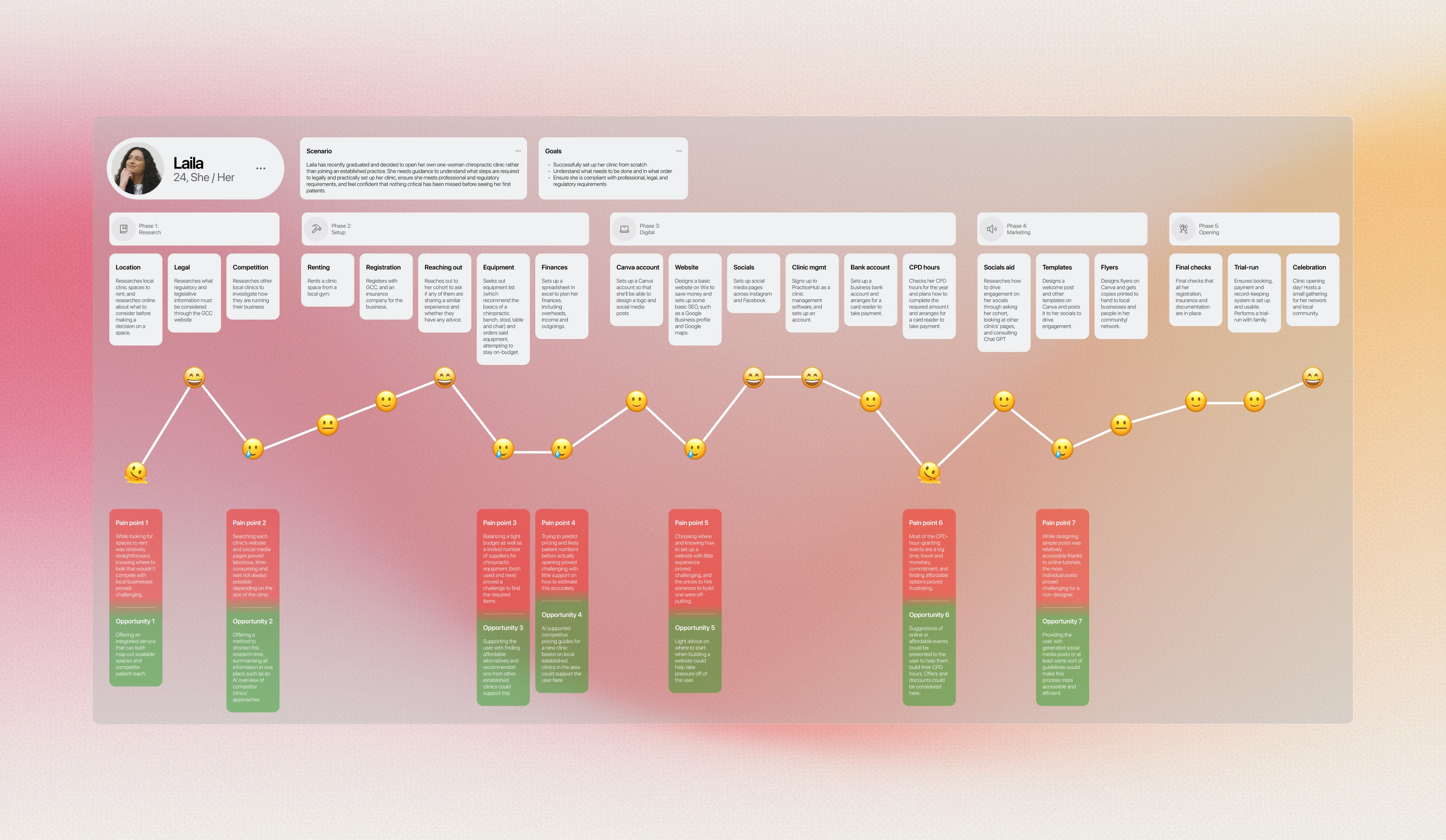
I carried out a deep dive into Laila, a developed user persona based on the real user interviews, to better understand her pain points and how the site could help to alleviate them. This included exploring a user journey map for Laila, which helped to identify four key pain points.
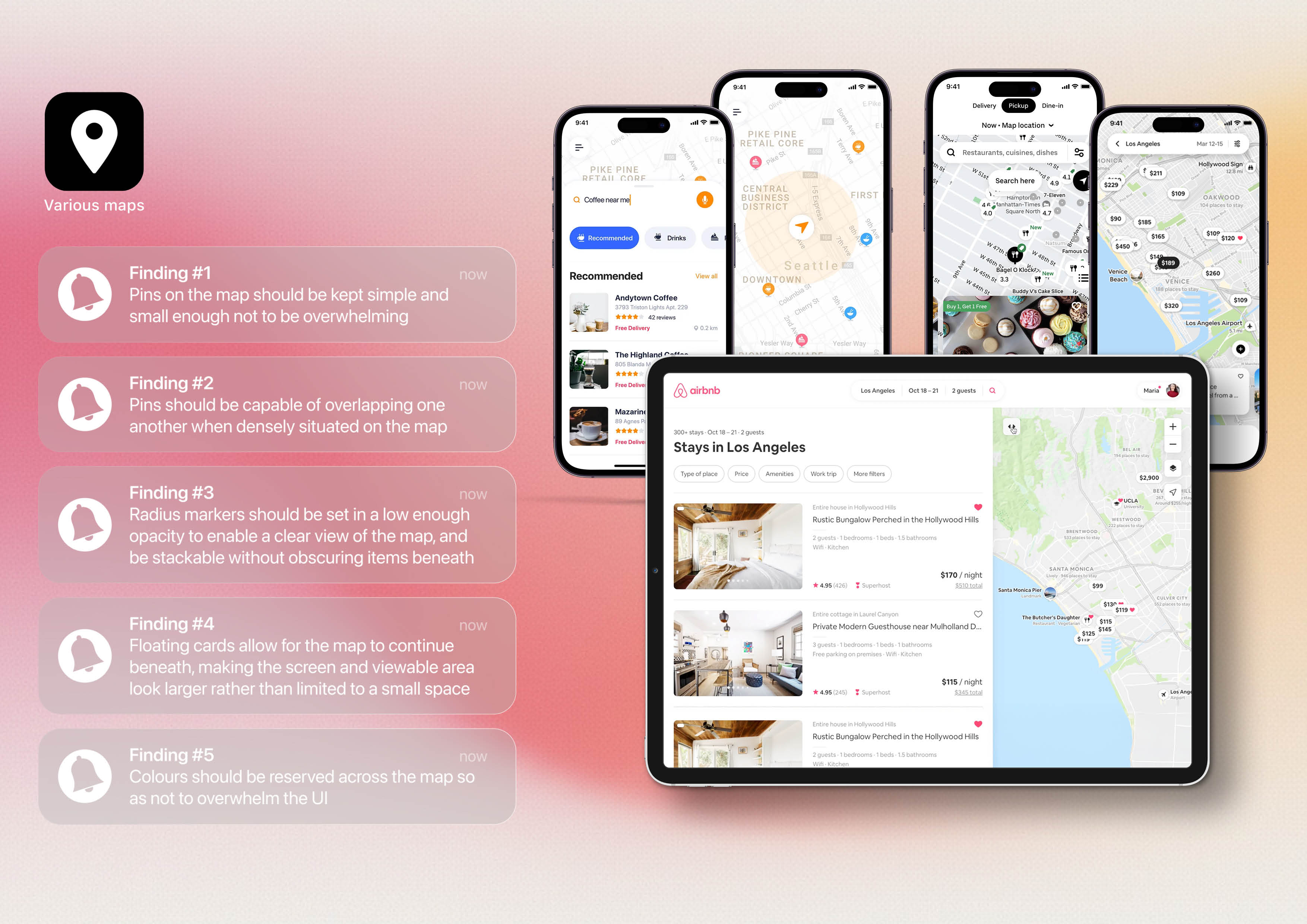
A detailed analysis of several existing platforms was undertaken, one of which is summarised above, including software targeted towards established clinics as well as digital products that contain similar features, such as map-based interfaces.
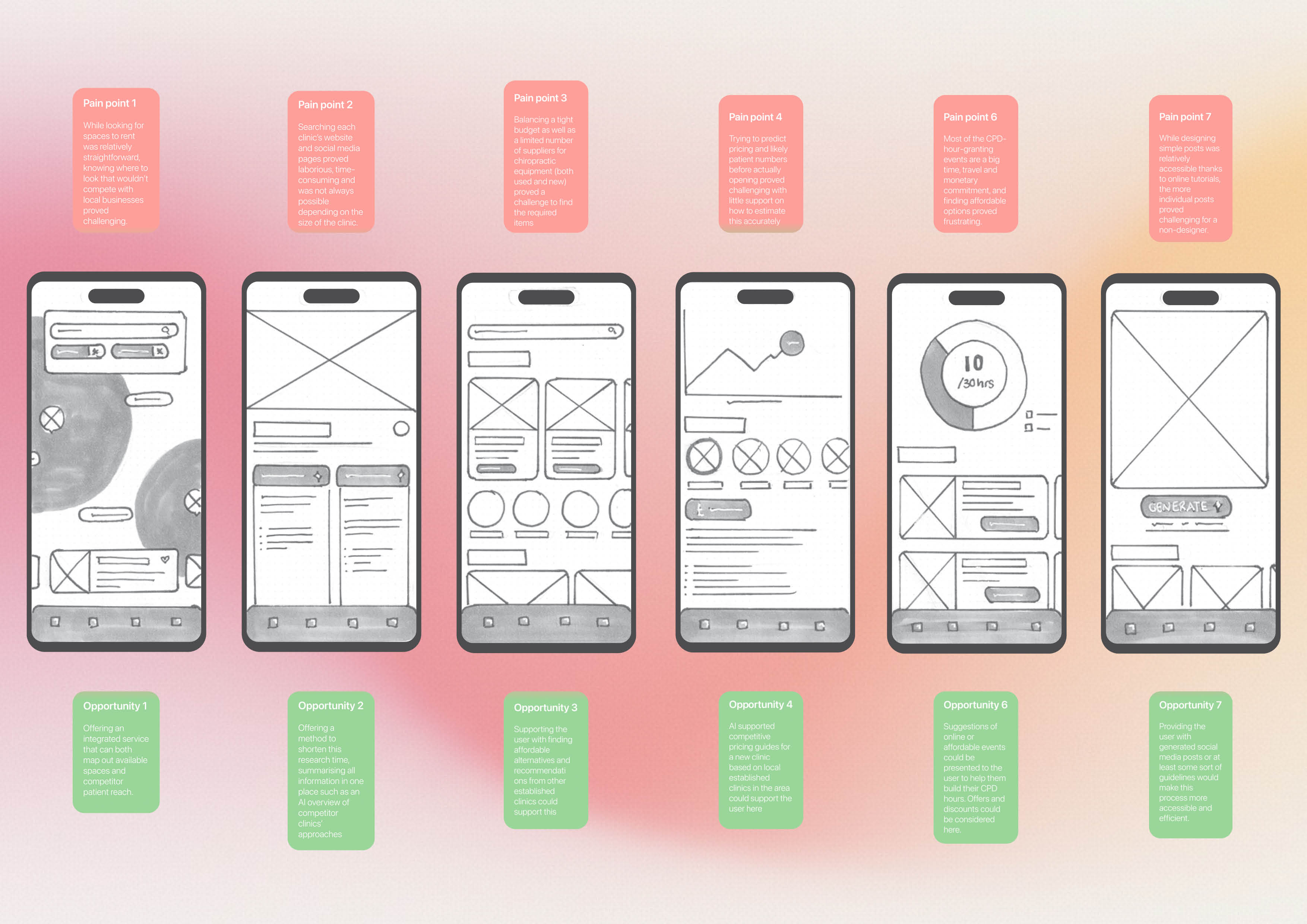
From this point, interface sketches were created for each opportunity identified during reflection on the determined pain points. While not all concepts were pursued, these sketches later formed the foundation for the products key features.
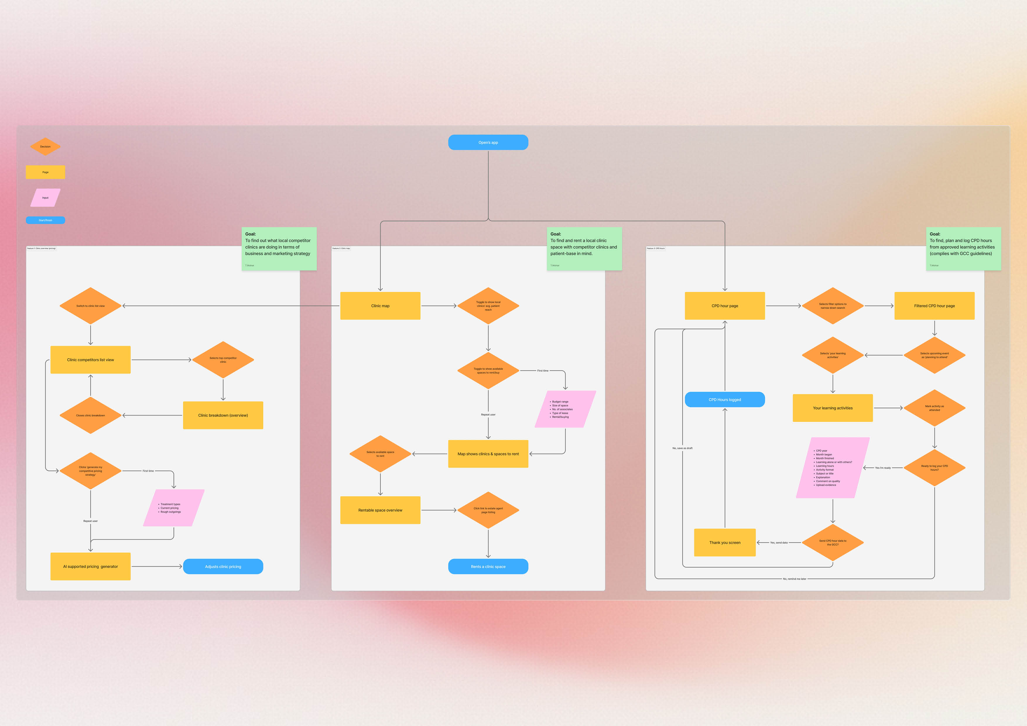
Page flows were generated once the features had been narrowed down to three key ones. It was important for the page flows to remain simple and user focused, ensuring that Laila would feel sufficiently guided through the process.
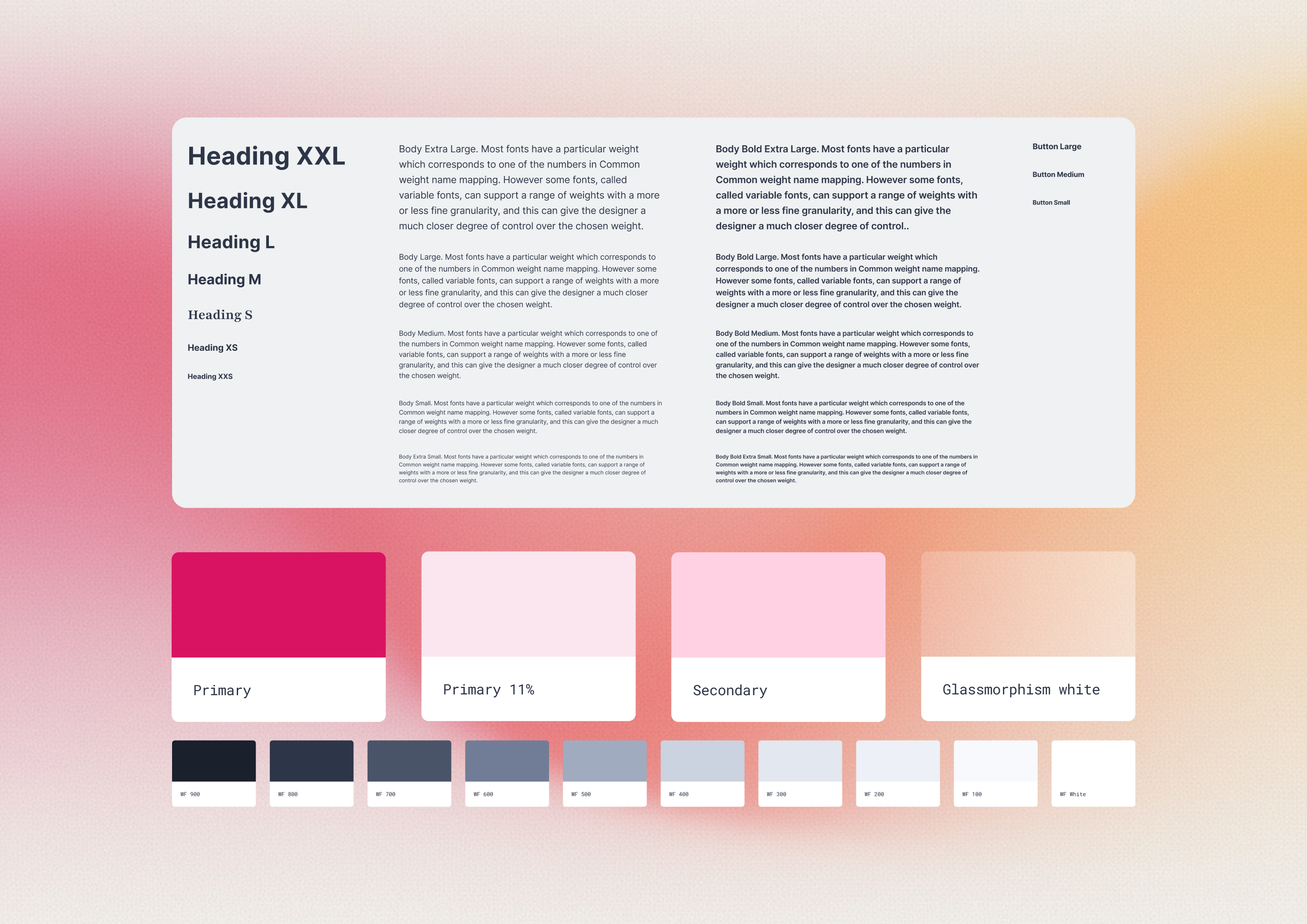
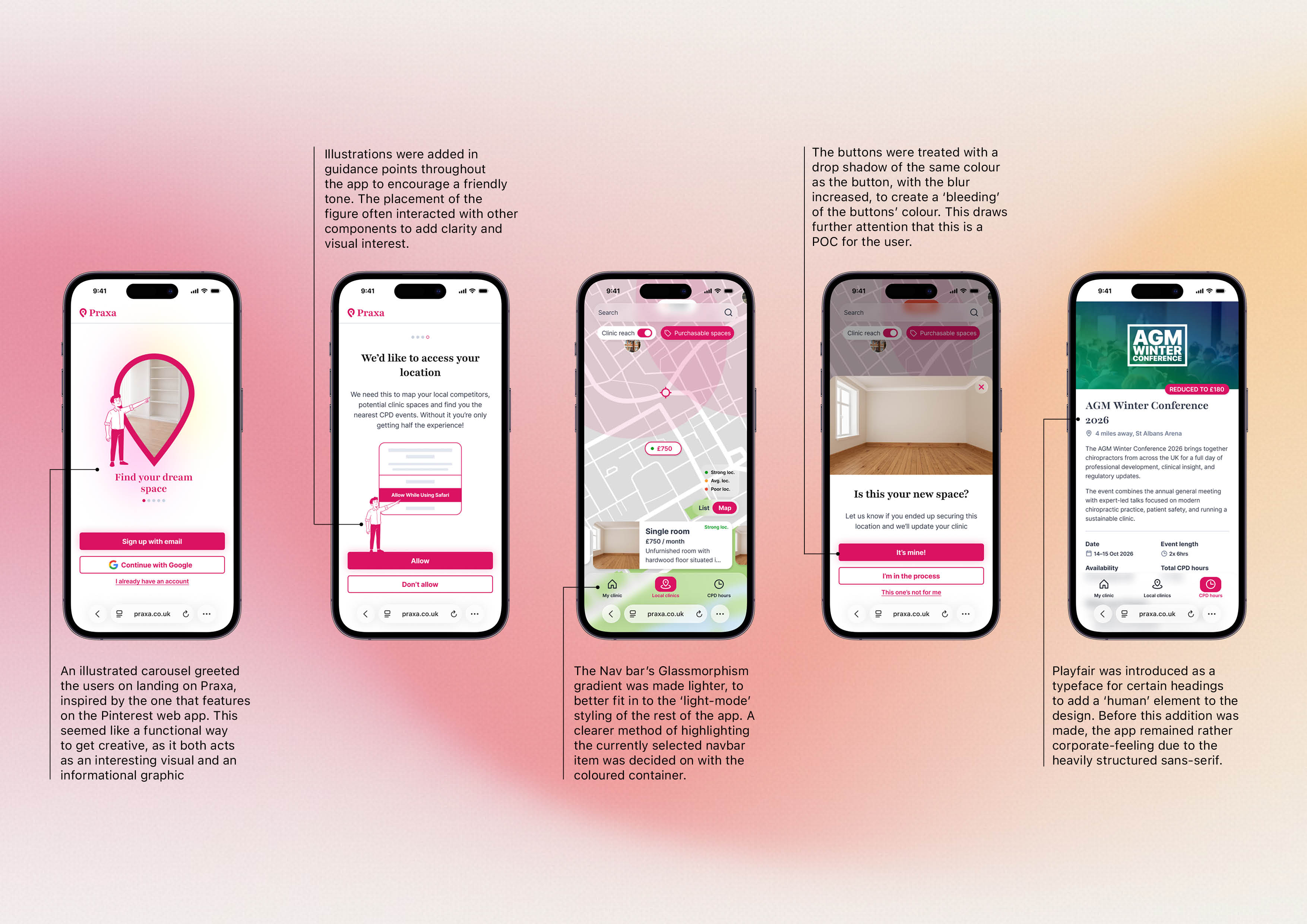
The branding, logo, and UI of Praxa took inspiration from the Pinterest web app and the Vagaro clinic support platform. The process of designing the logo was iterative, combining the form of a map pin with the letter p and using empty space to achieve this.
While most of the typography remained standard, using the legible and widely used Inter, the secondary typeface Playfair was introduced to add a touch of personality to the visual language. This reflects the themes of chiropractic, which takes a holistic approach to healthcare.
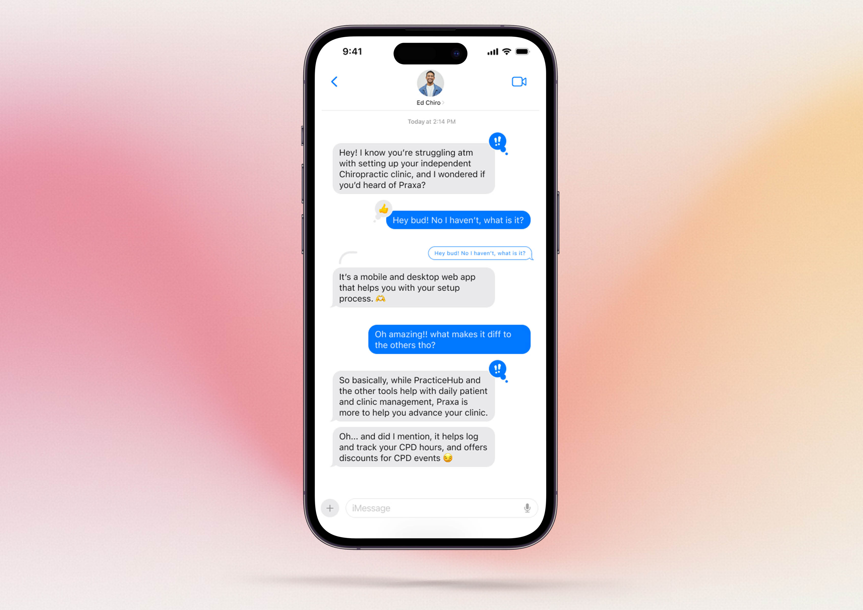
Friendly illustrations of a male mascot figure were introduced throughout the app when communicating directly with the user. These were generated with leonardo.ai and then edited in Illustrator to align with the wider visual language of the platform. Subtle blurred shadows were added beneath buttons to create visual interest, giving the touchpoints a slight glowing effect for the user.
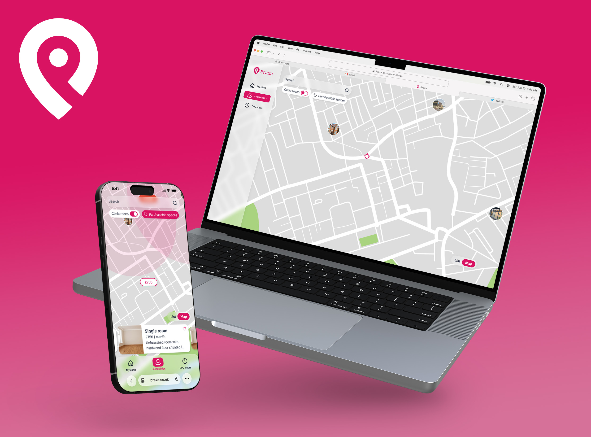
Praxa is designed as a web app accessible across both mobile and desktop resolutions. The decision not to build this as a native app came from a lack of need for regular returns to the app, the absence of complex device-specific functionality, and the desire to reduce development and maintenance costs while ensuring immediate accessibility for all users.