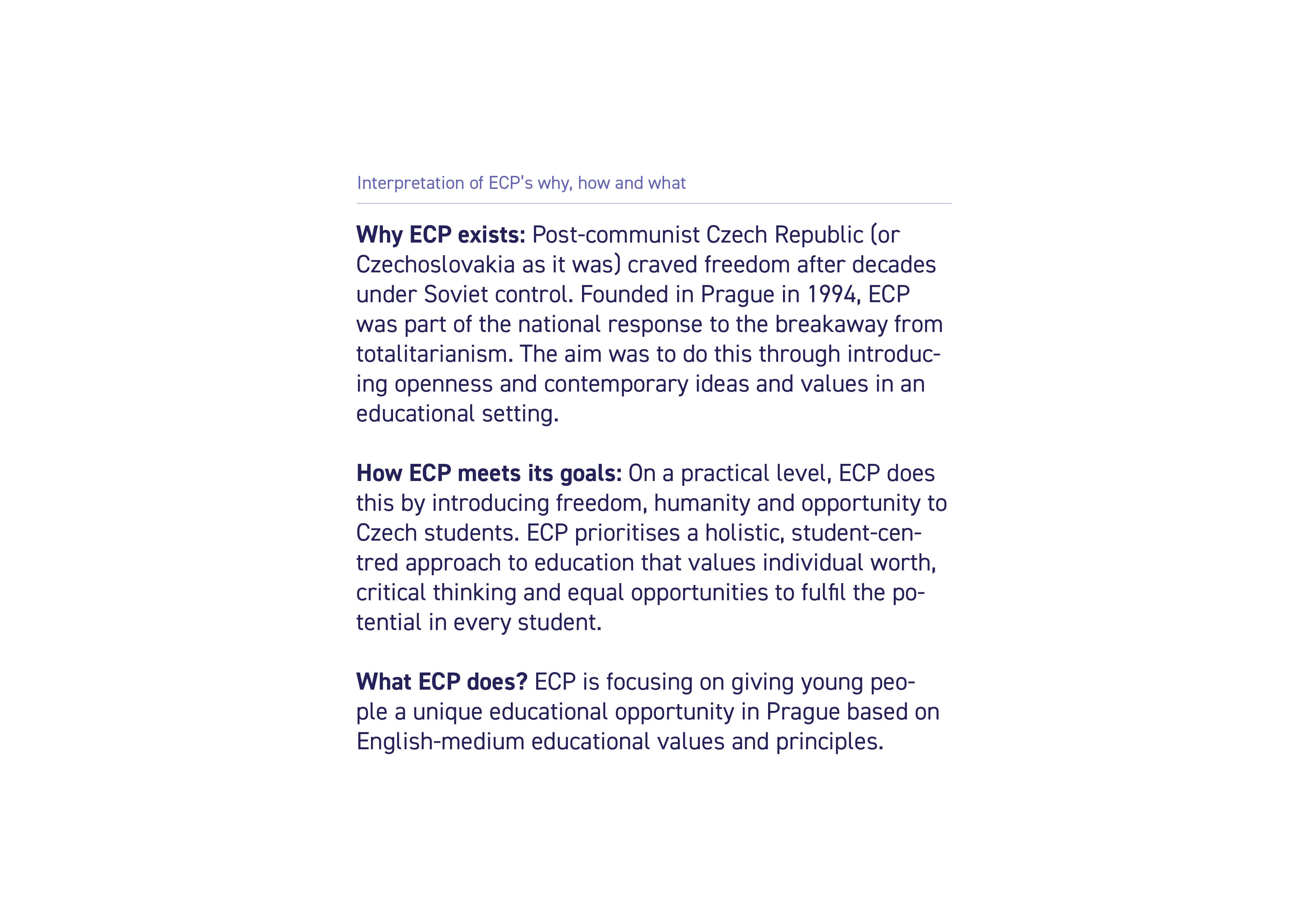
In order to understand ECP as a whole we needed to delve into the why, what and how to gain context behind the school. This steered us in the right direction to begin our research phase.
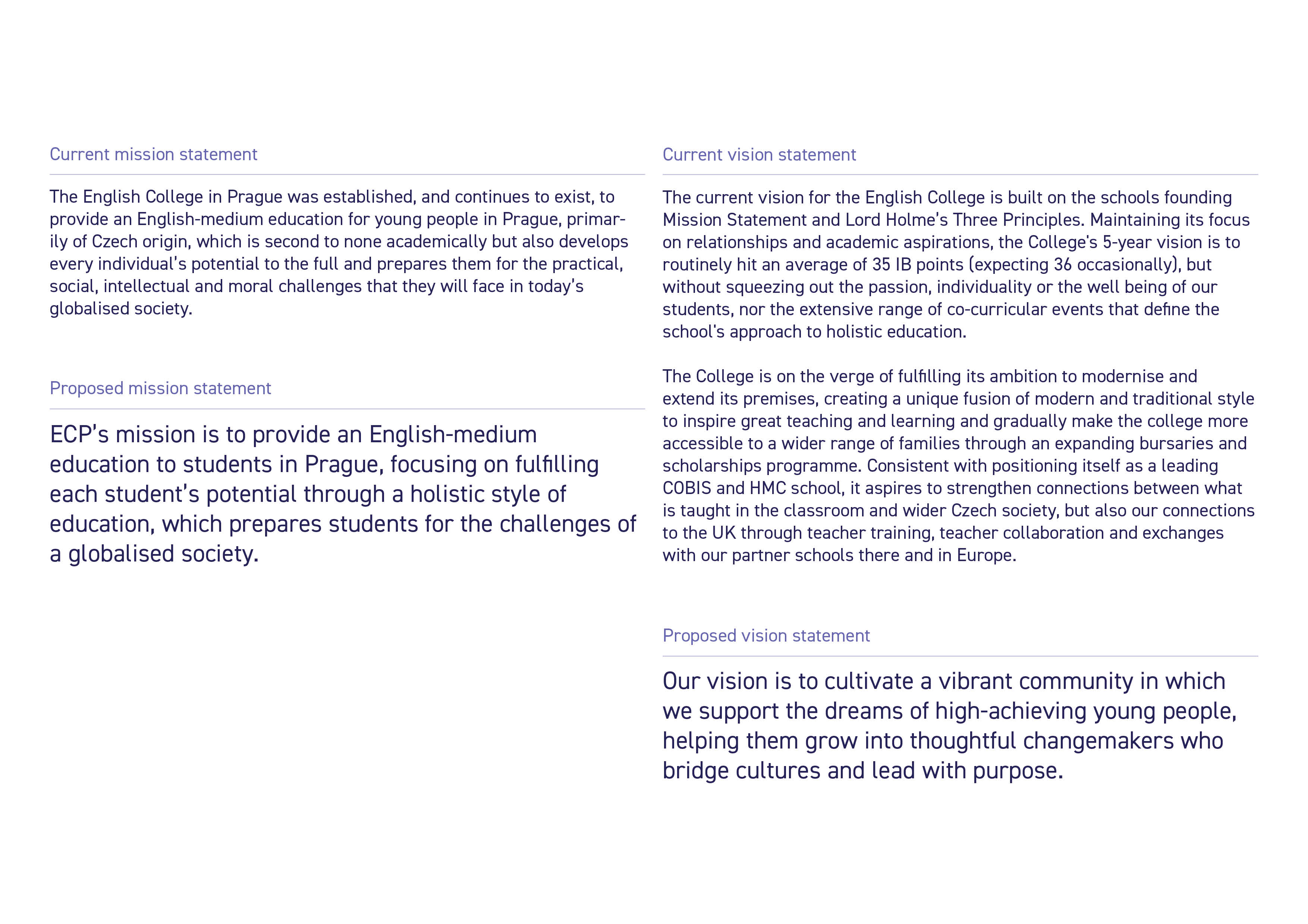
The existing mission and vision of the school were a little unclear. We gathered the closest we could find to current working statements (taken from ECP's current brochure and website), and refined them to be concise and purpose-driven.
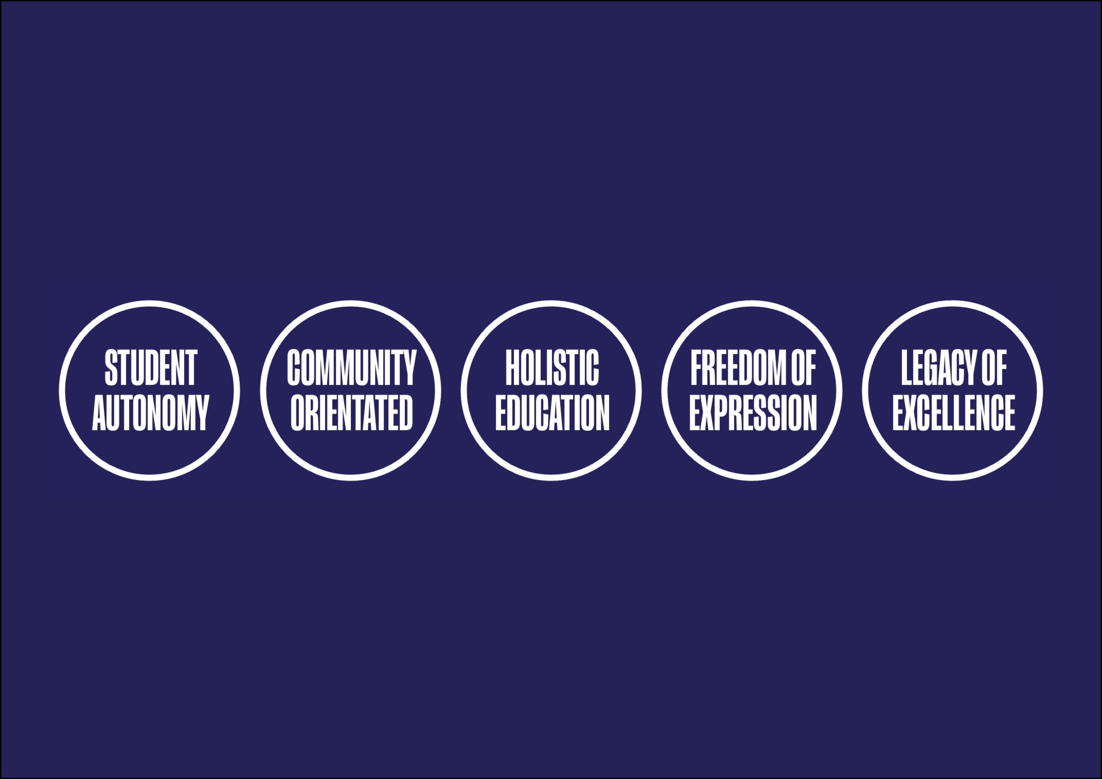
When visiting the school, we carried out a values workshop with various stakeholders, including staff, students and parents. We asked them to describe the school in one or two words, and we had a multitude of great answers. While some printed materials contained existing values, there was no consistency in their use. With this information, we narrowed down our findings into five new values that reflect ECP.
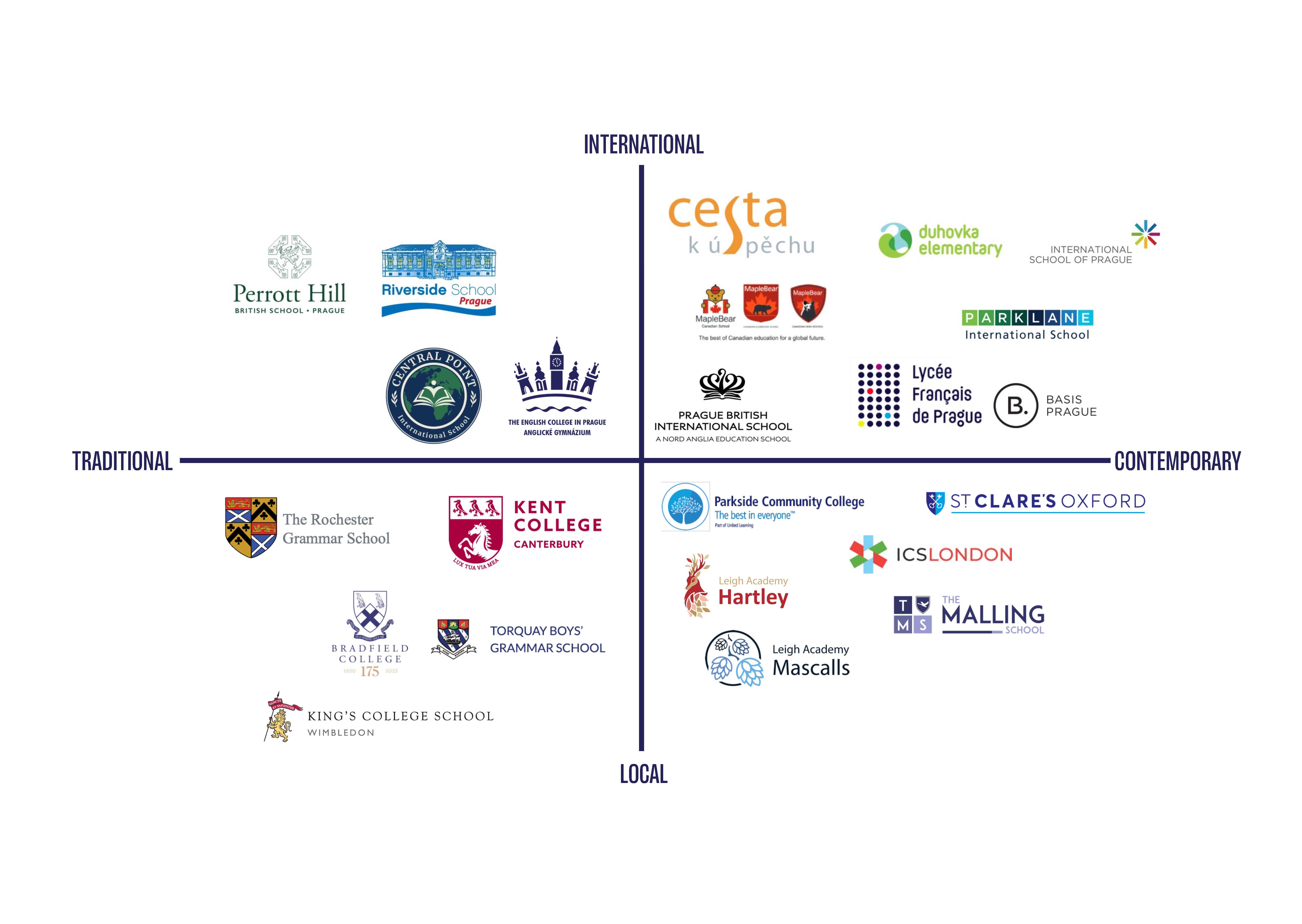
To carry out competitor research we completed a competitor matrix to look at the logos of 20 competitors, half of which are IB schools, with the other half being schools that share a similar age demographic. When placing ECP on this matrix it became clear that the school was sitting on the wrong side of the traditional vs contemporary spectrum so moving forward with the rebrand we aimed for ECP to match their contemporary approach to education by adopting this within their brand identity.
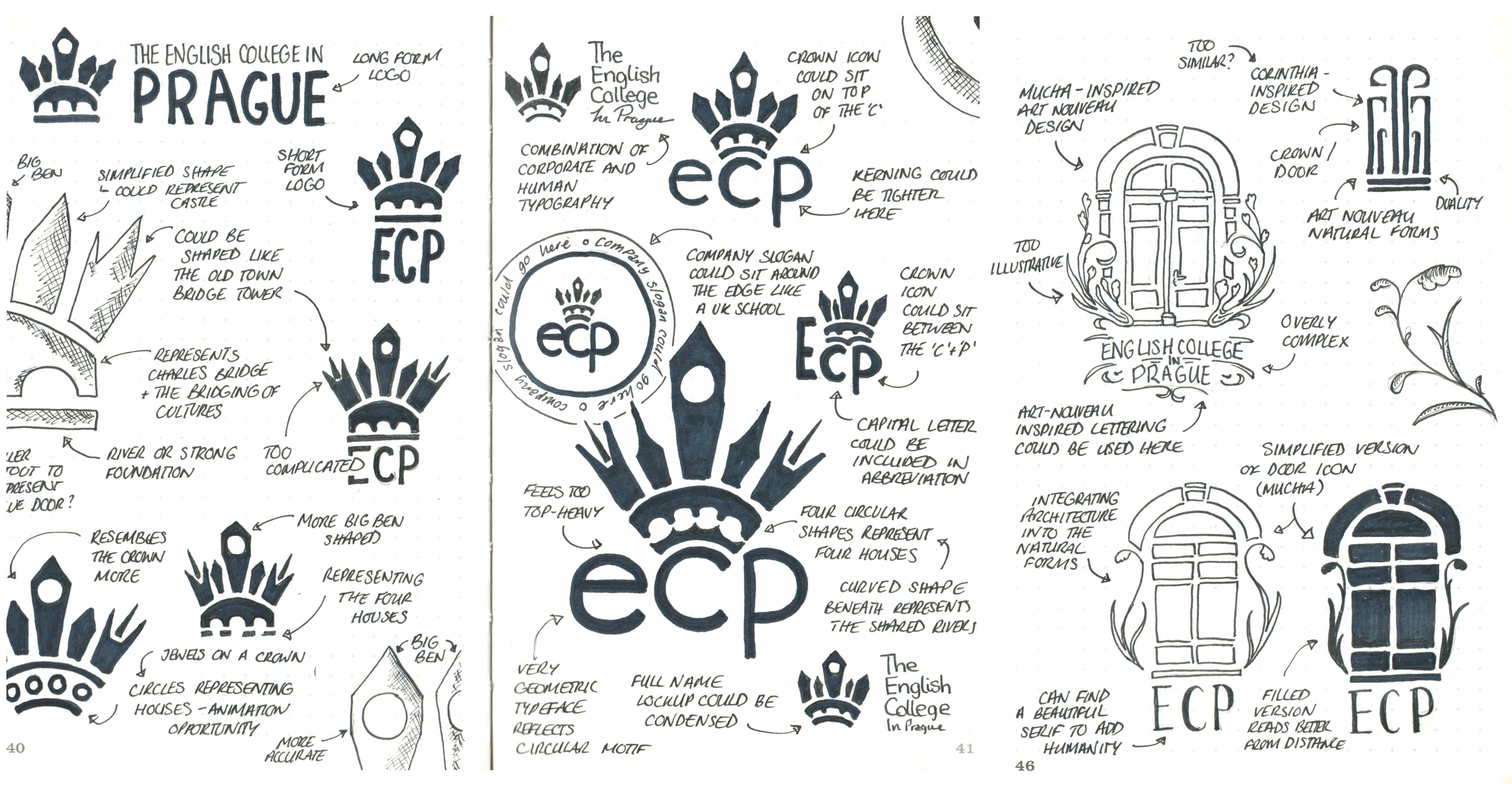
We explored a variety of different concepts while sketching, and found that they fit into two categories, logos referencing the crown that featured in the original logo and logos that used door-like iconography, in reference to ECP's iconic blue doors.
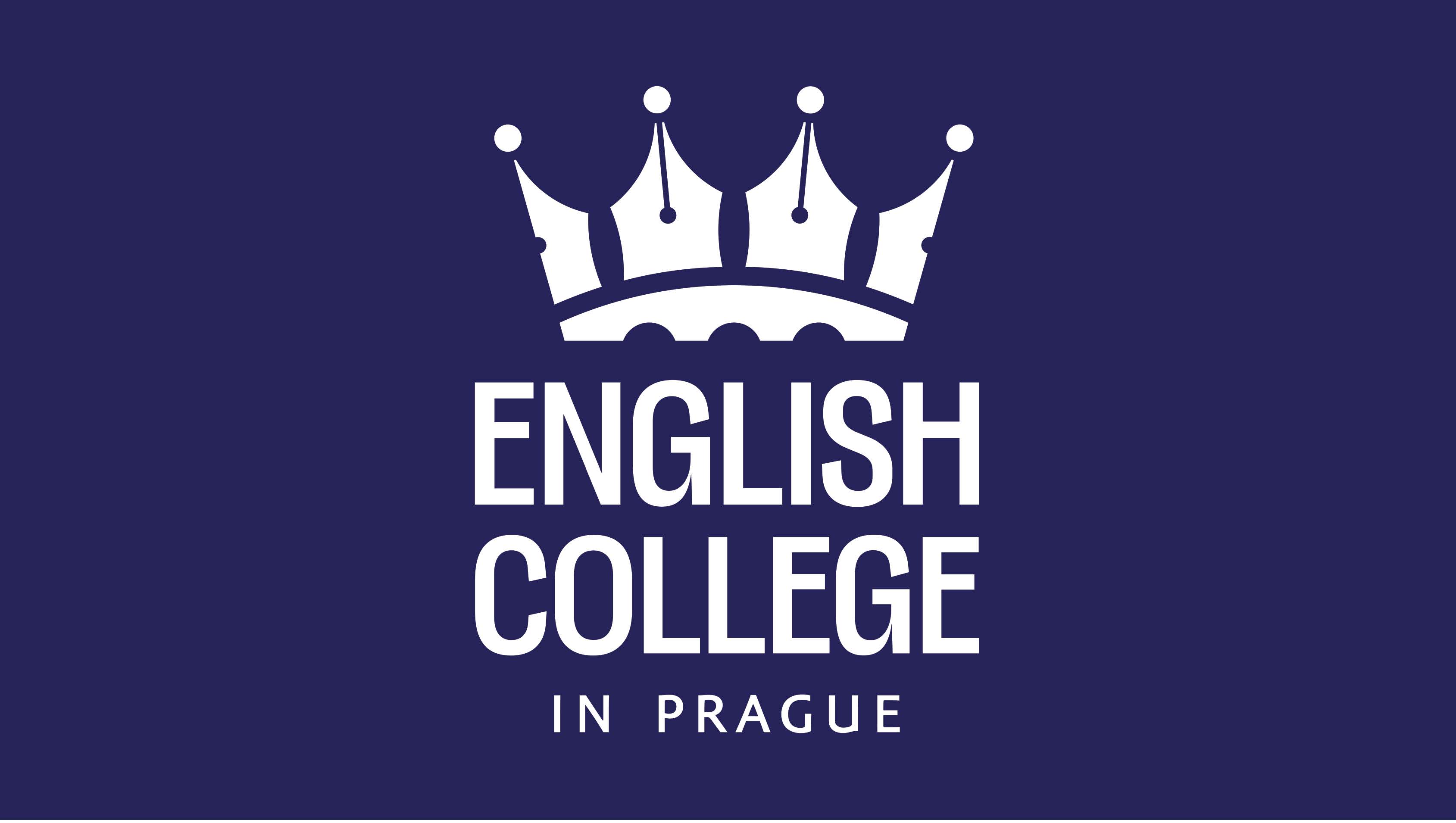
The refreshed logomark (which references the crown features several design details that make it meaningful to ECP's purpose and values. The shapes within the logo could represent students coming together, spires of a building (in reference to Prague being the city of 100 towers), a pen nib, a bridge (symbolising the bridging of culture), and the four houses that students are separated into (which were highly valued by students).
We paired the logomark with “English College” set in Lektorat (custom-altered to give a nod to Art Nouveau typefaces), and “in Prague” set in Amor Sans. Lektorat is a typeface designed by graduates of Reading and is fully variable, while Amor Sans is a typeface designed by the Czech type foundry Storm Type Foundry. Both typefaces support the Czech language.
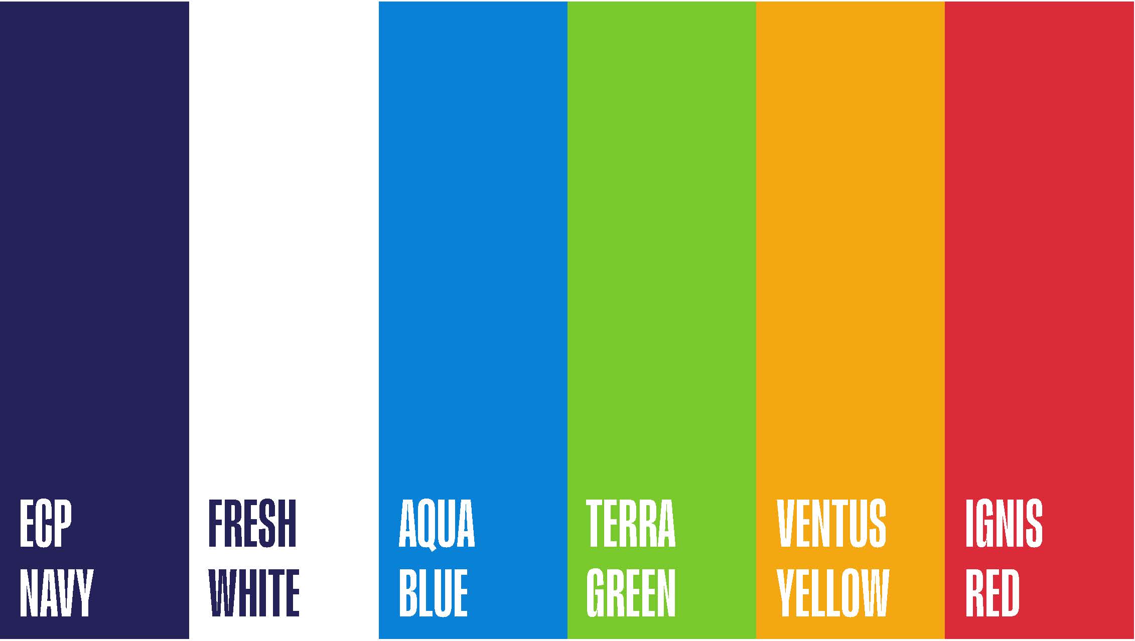
As the original ECP navy was derived from the iconic blue doors at the building’s entrance, we chose to carry this through into the refreshed colour palette. We paired it with a fresh white to reference the school’s newly painted exterior, and refined the house colours to ensure they speak the same visual language.
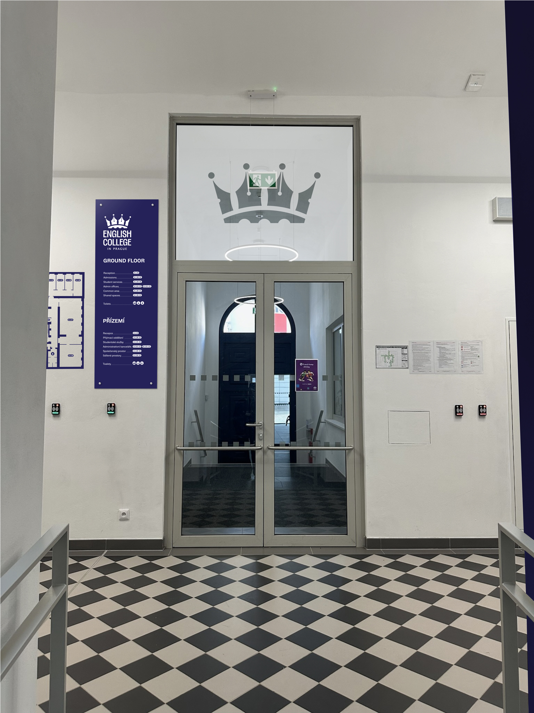
The wayfinding proposal begins in the shared space between the two opposing entrances to the building, with a window decal placed above the doorway, adding the subtle touch of “crowning” students as they walk through the entrance. This area would also feature a wall-mounted floor map and a wayfinding column positioned across the hallway.
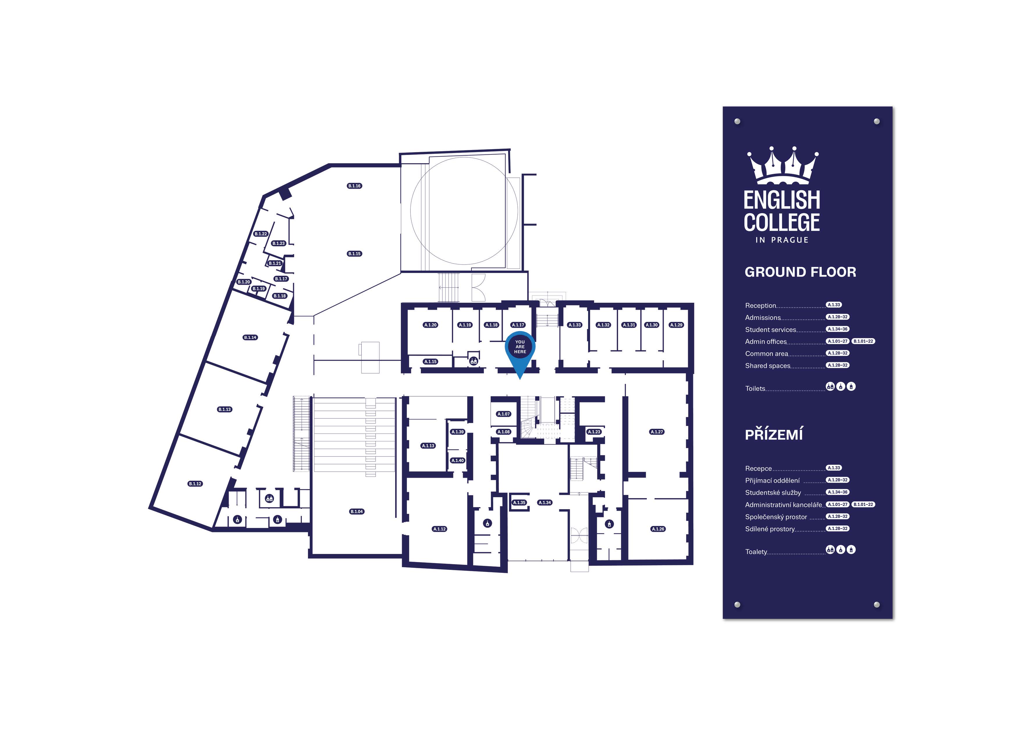
The map has been created to be used per floor, to guide students to the correct space they are looking for. It outlines both the old and new wings of the building, splitting these into “A” and “B” in the numbering system. The map itself has no background so this can be adhered to the wall as a visual. This is paired with the descriptive panel placed on the right in colour, intended to be more distinguishable to guide users effectively.
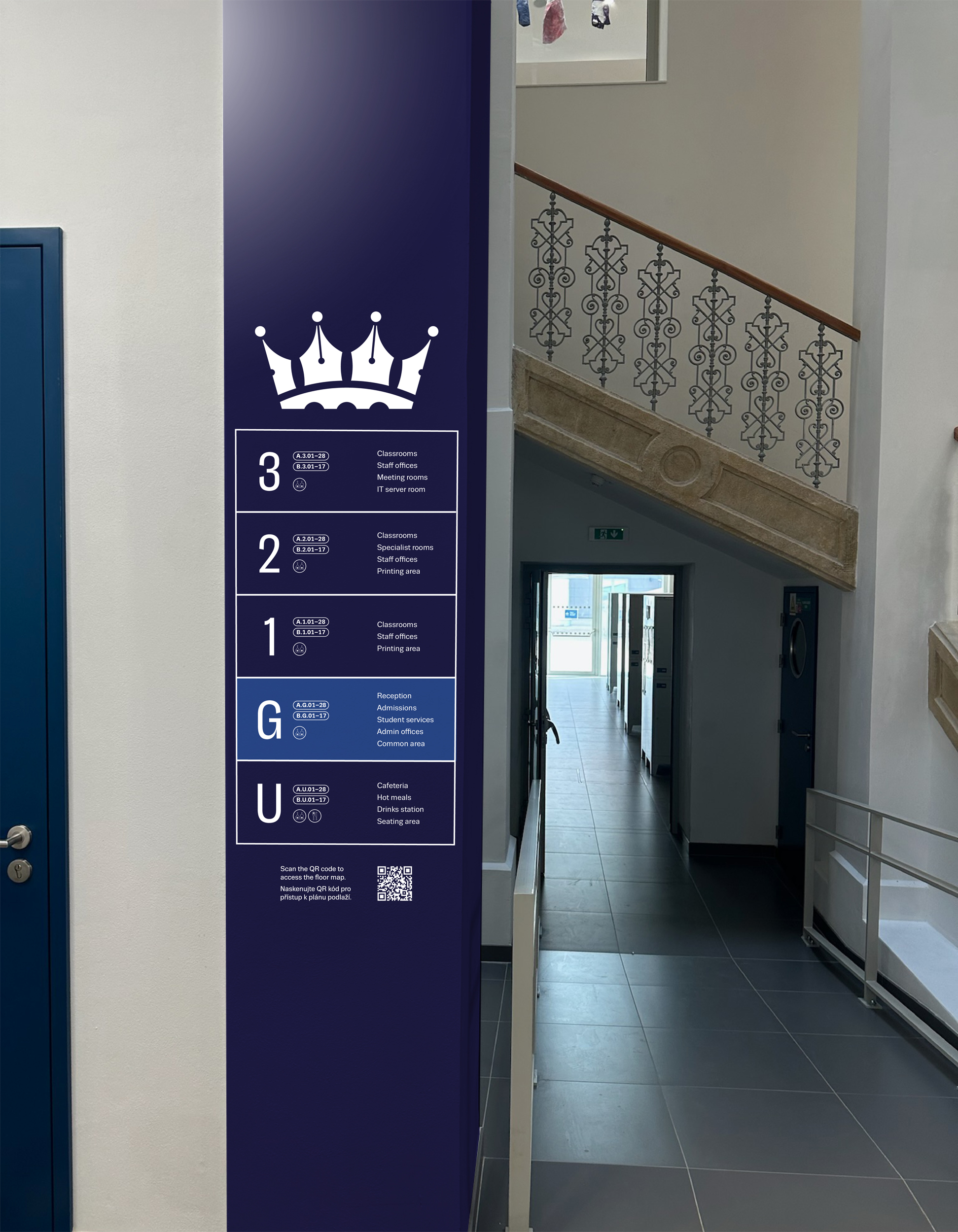
Wayfinding columns act as key navigation points within the building, using the ECP navy as a distinguishing feature for this. Included are floor numbers (highlighting the current level in a lighter blue), room number ranges, amenities, and a QR code linking to a virtual version of the floor map.
Floor numbers are designed to be bold and immediately recognisable, helping users align themselves with the space they are in. The simplicity ensures they remain effective in high traffic or visually busy areas. Small details of the room number range has been included around the form of the larger graphic as an additional piece of information for the users.The room numbering system is designed to be clear and highly legible at a distance. An interchangeable sliding room-name card has been included to highlight certain rooms for easier navigation.
External signage is the first touchpoint of the brand linked to the building, ensuring visibility and recognition from a distance. The application shown incorporates both English and Czech, reinforcing the school’s international outlook while ensuring accessibility and inclusivity for all audiences.
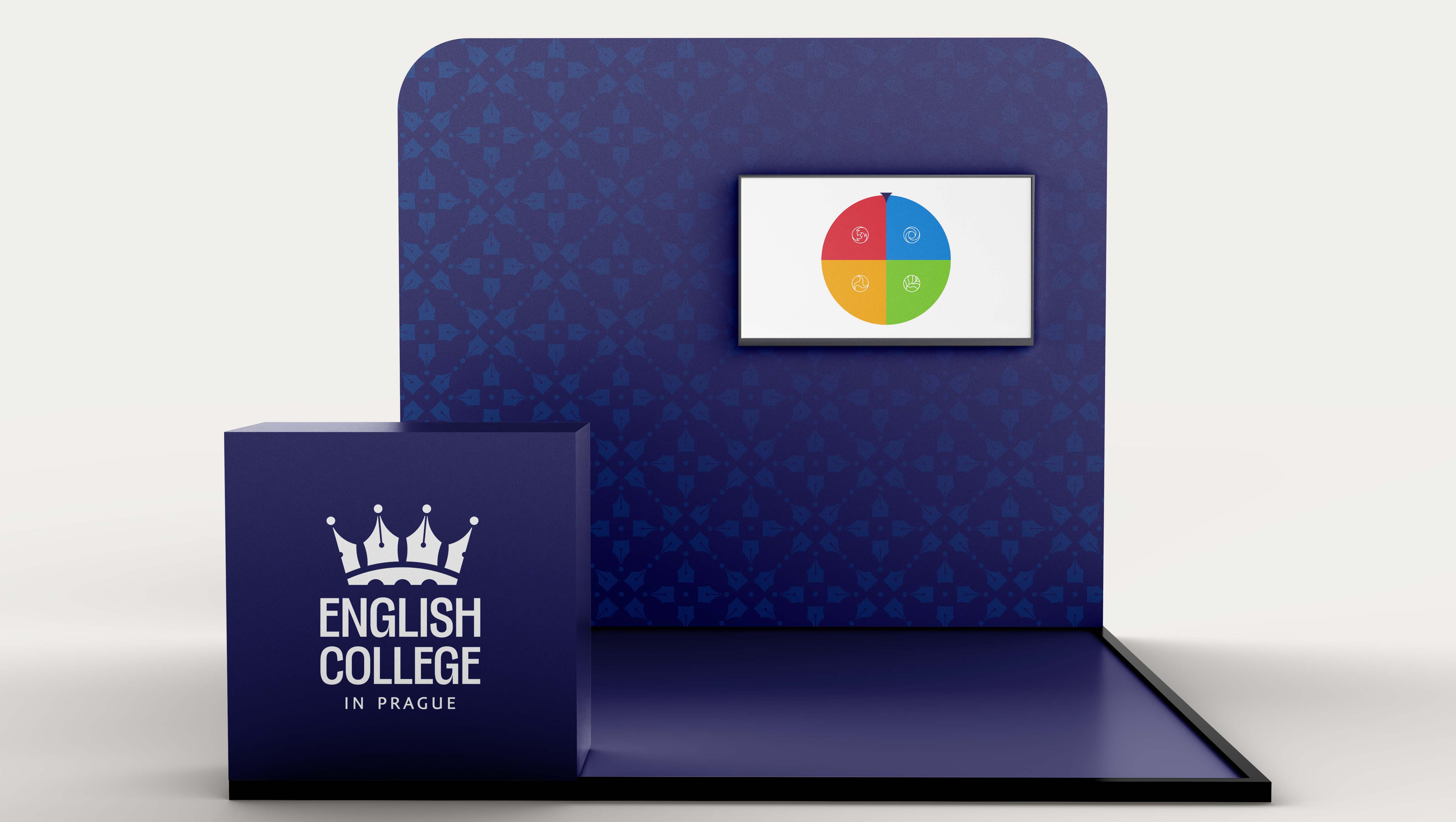
We developed a new marketing strategy for ECP’s presence at school fairs. As stakeholder interviews revealed a lack of engaging assets to draw attention to the school’s stand, beyond a leaflet, we proposed a “spin the wheel” game. This would allow prospective students to discover which house they land in and begin building an early affinity with the house system, reflecting the strong sense of enthusiasm observed among current students.
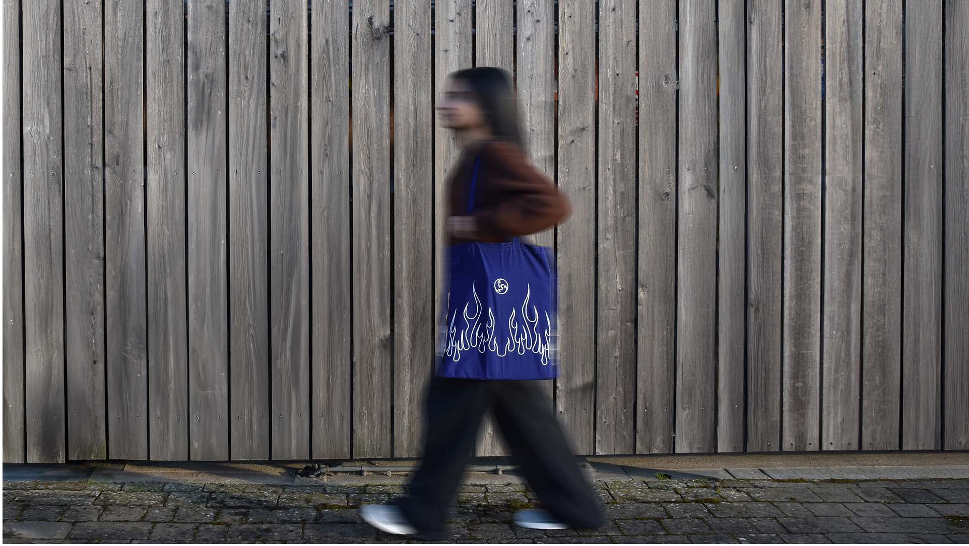
As part of the “spin the wheel” game, house-specific merchandise would be awarded based on the result, allowing students to walk around with tote bags and other items featuring the flames of Ignis, the waves of Aqua, and so on.
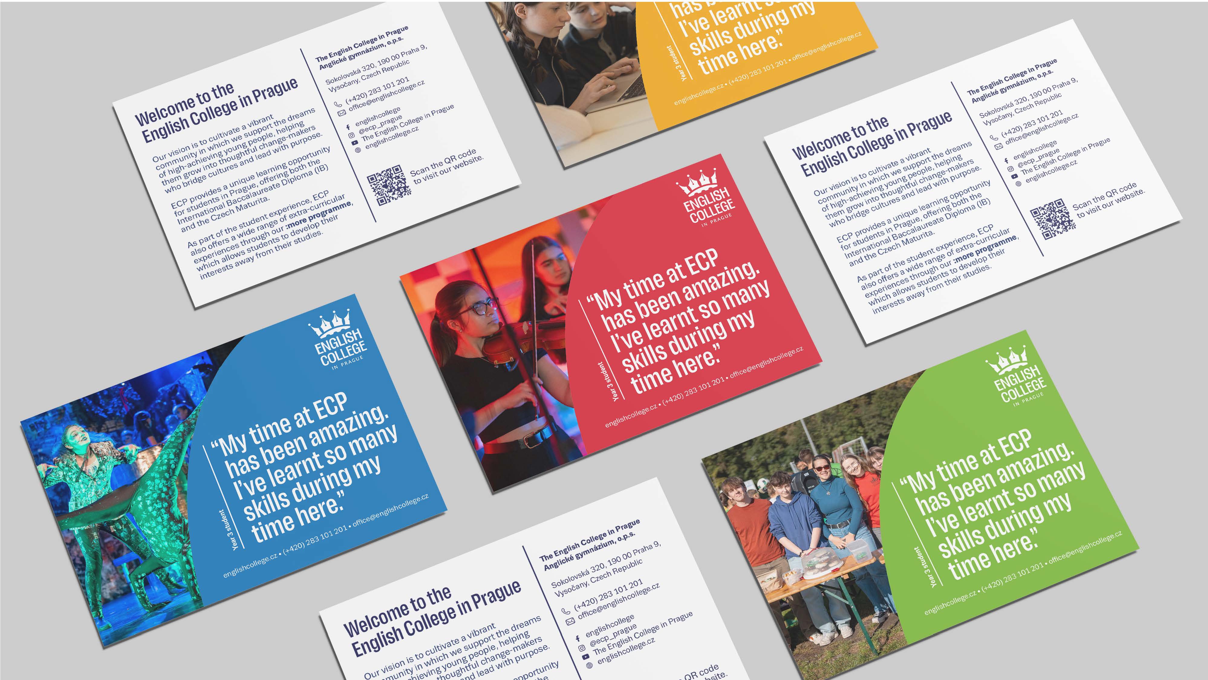
The merchandise would be paired with a postcard themed around each house’s colours. Images have been selected to complement these colour palettes, while the reverse of the postcard remains consistent across all four designs, featuring key introductory information.
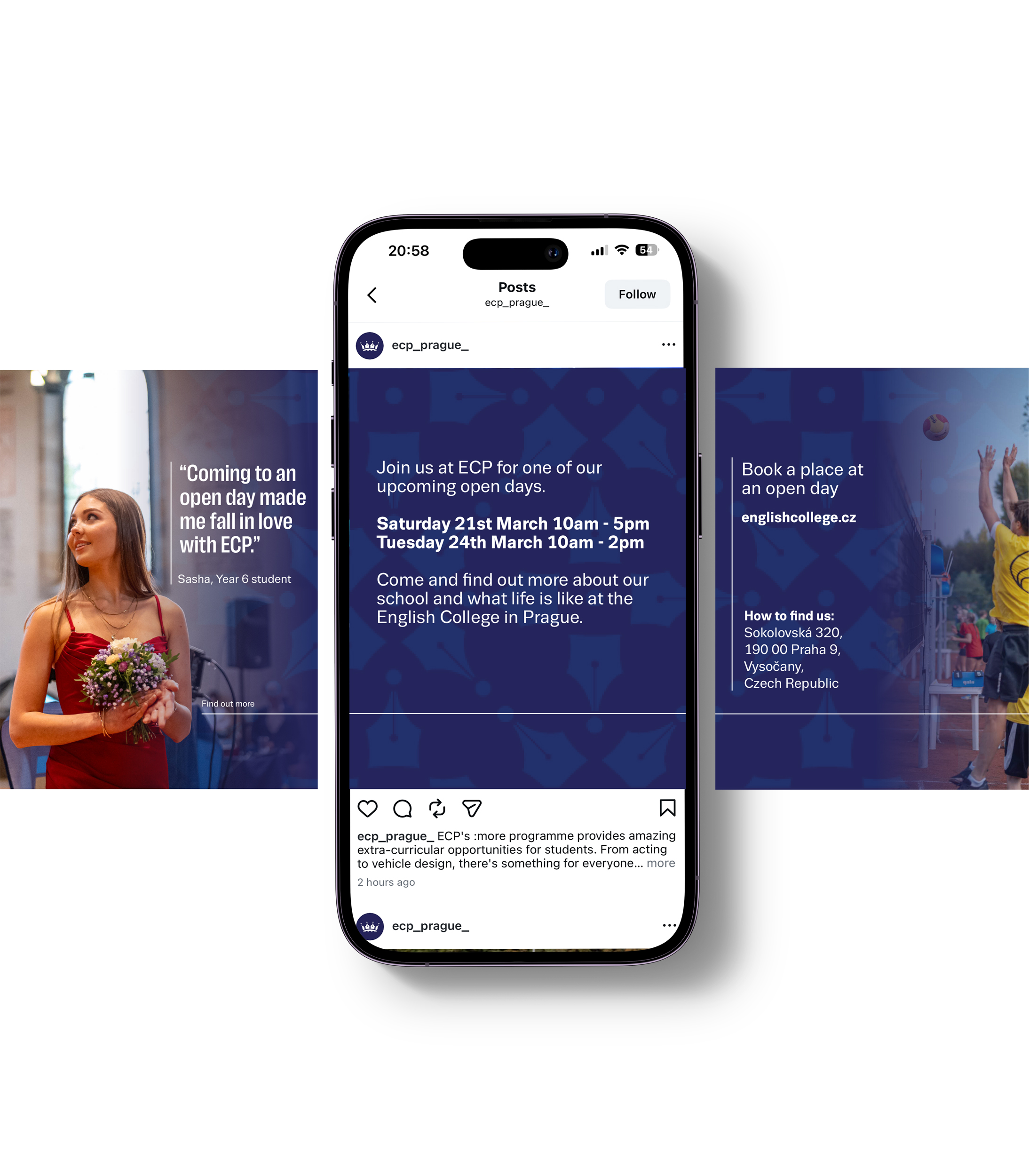
This is a proposal for a carousel post designed to promote events such as open days. The use of gradients, paired with a low-opacity background pattern, can be applied using ECP navy alongside the wider brand colour palette. This example highlights student voice through the inclusion of quotes, addressing a key finding from the user research that student voice was previously underrepresented.
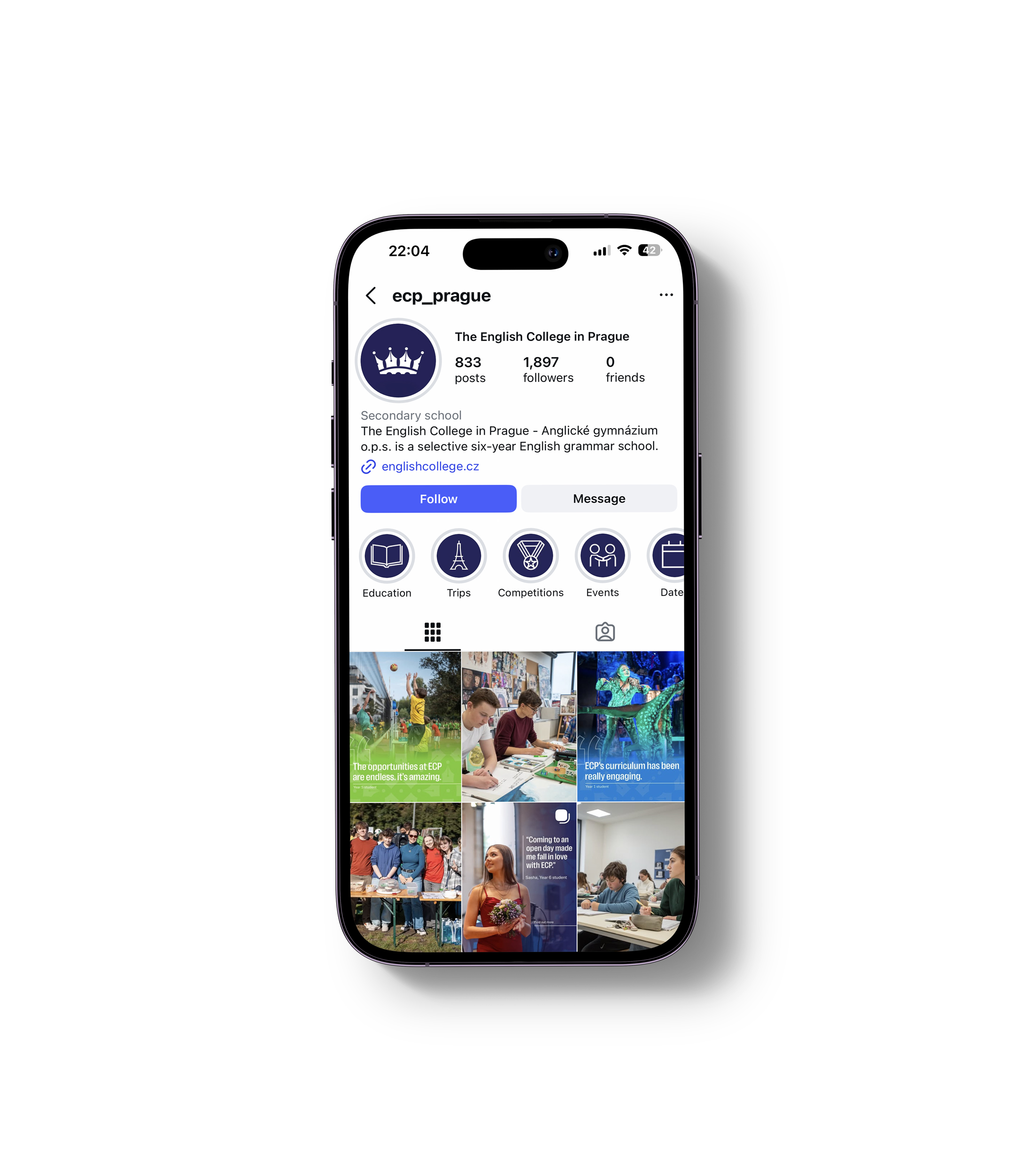
The Instagram mockup highlights the use of the logomark as a profile image for clarity at small sizes, alongside consistent highlight covers featuring outlined iconography. Post layouts follow a structured system, using gradient colour application on standout posts to maintain a cohesive feed while allowing for varied content.
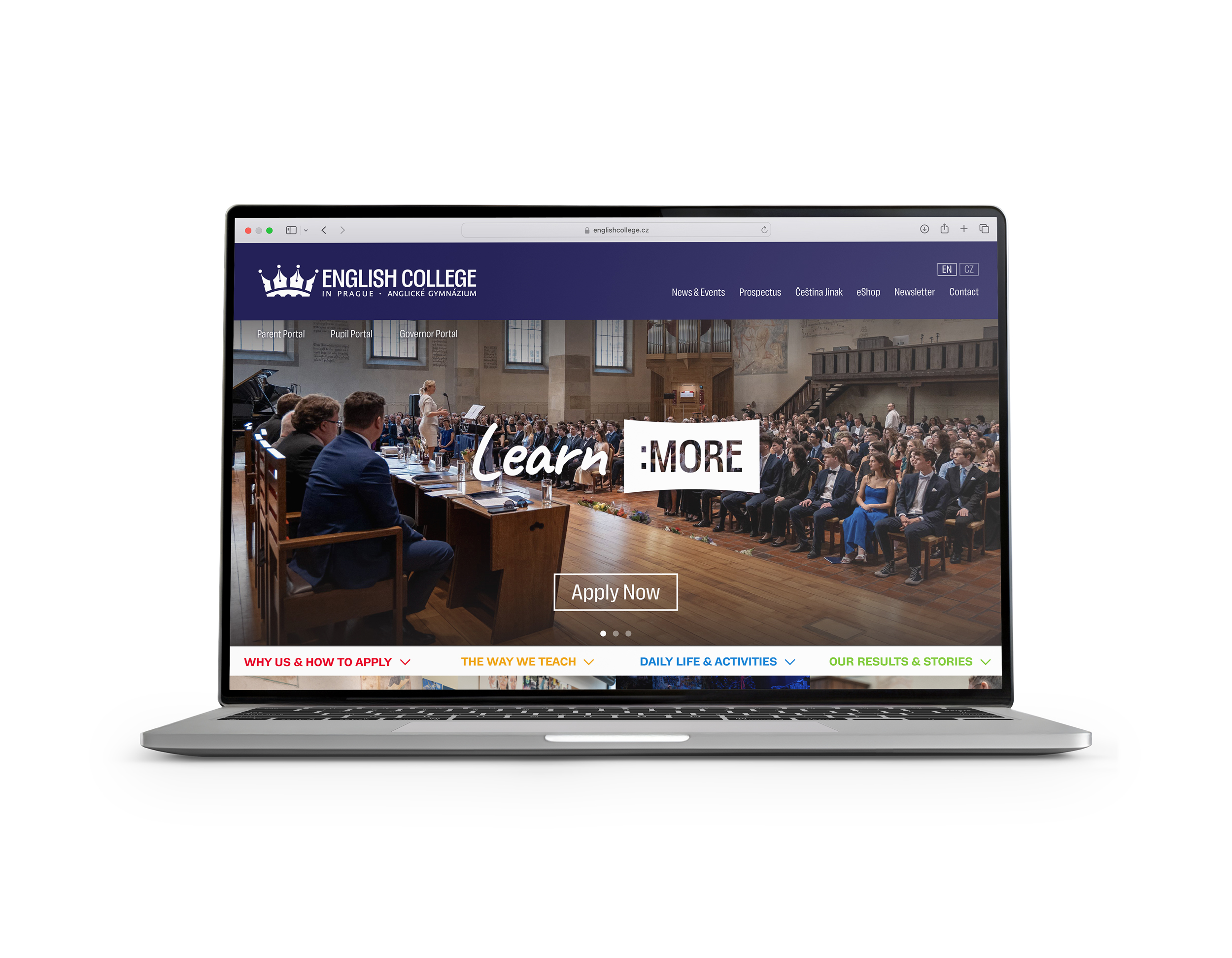
The website has been refreshed to align with the updated brand identity, using ECP’s colour palette, typography, and imagery to create a simpler experience. A clear visual hierarchy, moving from large to smaller imagery, improves navigation and readability, while simplifying content enhances usability. The horizontal version of the logo has been used to accommodate
both English and Czech naming, reinforcing the school’s bilingual and international positioning.
While ECP had an existing motion graphic featured at the start of their video content, it felt somewhat outdated and lacked fluidity in its motion. We proposed two new motion graphics to open and close their videos, featuring the logo and incorporating the tagline in the closing sequence.